nimblist
Web Design
Architecting a sophisticated content management system to pair with a sleek and minimal design.
Nimblist came to us on the brink of a complete rebranding. They were changing their name and identity to better reflect the unique, top-of-the-line productions and special events they create for a wide variety of clients and partnerships.
The Challenge
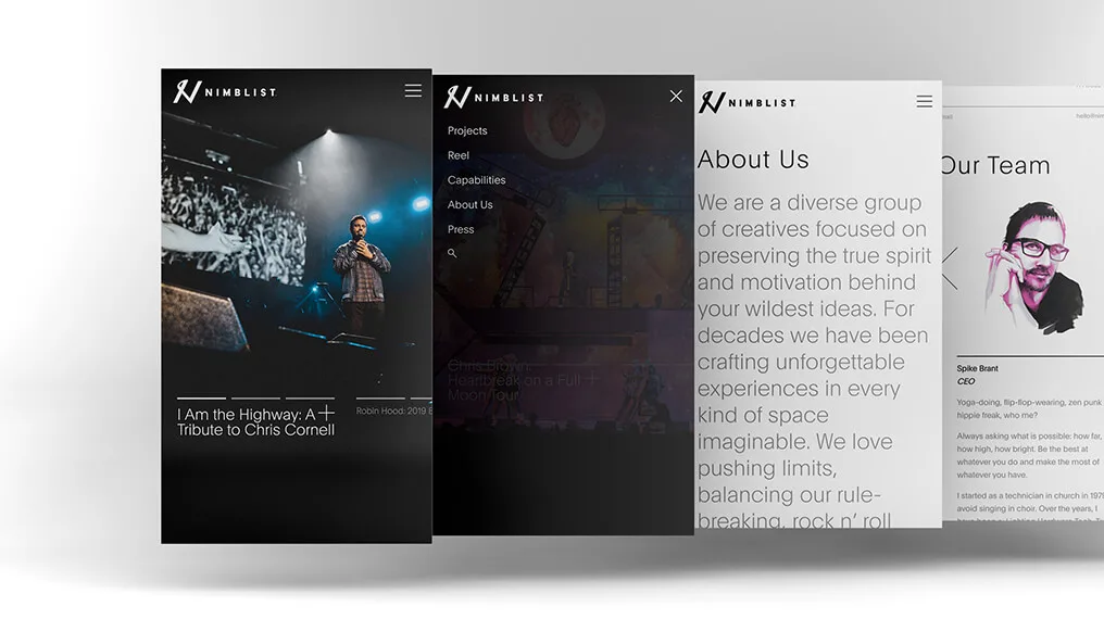
The Nimblist team wanted a website that reflected their attention to detail and one-of-a-kind approach to the needs of their clients. We were tasked with developing a dynamic, well-thought-out website design.
Our Strategy
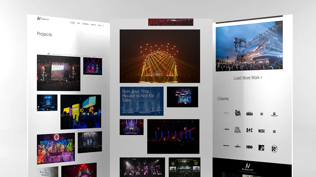
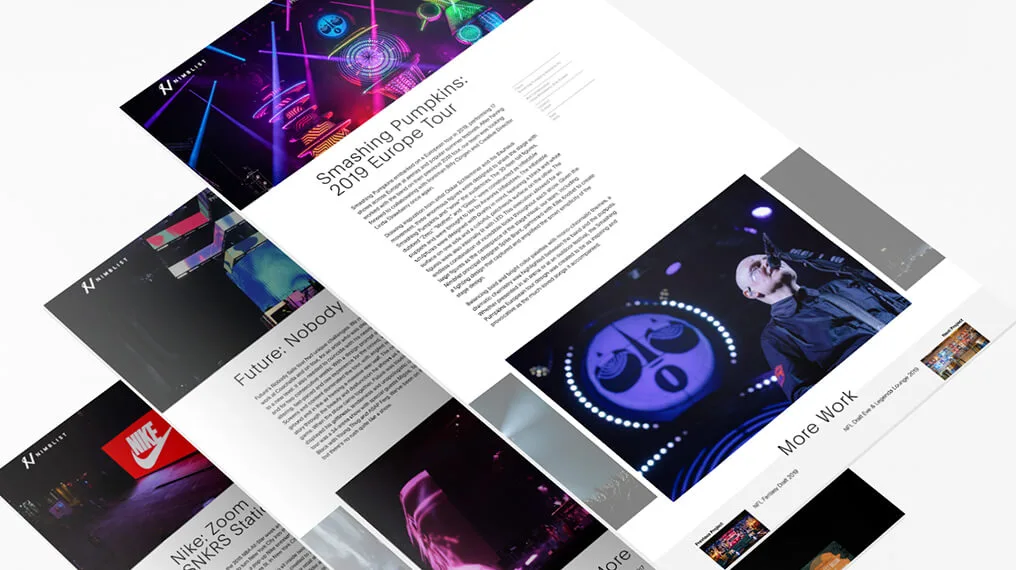
We worked with a design agency in New York City that was responsible for the new brand identity that Nimblist had rolled out at the beginning of the year. The design included an isotope grid layout and AJAX transitions between page loads. The site is focused on user experience and the representation of Nimblist’s work, much like their environmental installations.
We used a random page layout triggered by page load to showcase Nimblist’s eye-catching projects. It was important for us to enhance smooth page transitions for users, while still keeping an engaging randomization element.
The Results
Nimblist’s website pushes the boundaries of design, development, and creativity. It also offered us the opportunity to build out page templates and elements that pushed the skills of our developers. The finished project is truly a piece of art and a project we’re proud to highlight.


