What Is Rebranding & How Did Tower Complete Theirs?
- Tower After Hours

Welcome back to another episode of Tower After Hours! We’re excited to have had so many great guests on Season 1 and this episode is no different. We’re excited to welcome Grace Hurst, Tower’s Content Team Lead, and David Kimmick, our Creative Director and Design Team Lead.
In this episode, we dissect Tower’s rebranding from start to finish. Starting with the initial introduction all the way to post-launch celebrations. And if you’re reading this blog, you already have an idea of what our rebrand looks like.
Alright, let’s dive in.
How To Know It’s Time For A Rebrand
{1:25} As a marketing best practice, we recommend updating your website every three to four years. And we wouldn’t be a very good marketing firm if we didn’t practice what we preached. Something that shocked us was that the logo is as old as our company. So, as you can imagine, our company has changed so much over the last 27 years and the previous logo no longer represents who we are now.
{4:05} From a content standpoint, Grace focused on the tone of the website and as the brand evolved, the tone needed to as well. Two websites ago, we were very casual and laid back, and in the last iteration of the website, we took a more mature tone.
We combined these approaches on the current website to represent us as being professional and personable.
The Value Of A Rebrand
{8:13} As a marketing agency, we understand the importance of every rebranding component, including a bigger website redesign, but being able to convey this value to your company and leadership can be challenging.
Your website is considered your “24-hour salesperson” so if it doesn’t resemble who your company is or what you do, it won’t make for a very good sales tactic. Your brand is the photography, color, tone, and voice. On the other hand, your logo is the symbol that represents you.
The goal then, is to have all of these pieces work together in a cohesive way to authentically represent your company. Additionally, these pieces need to resonate with your internal team. If your internal team doesn’t understand your brand, how can you expect them to sell it?
As Kimmick says, “be critical” and dive into the different types of rebranding strategies to find one that meshes well with your company.
Measuring The Success Of A Rebrand
Unlike a PPC campaign where clicks and conversions help define your success, a rebrand or new logo is harder to measure. However, there are a few things to look out for post-launch that can help measure your success.
- Internal Reaction. Is there excitement within your internal team?
- Client Reaction. What are your clients saying about the new brand?
{18:03} When looking to propose a new website redesign, you’re also looking at a significant investment in time and cost. It’s important to understand the signs indicating it’s time for a website refresh, along with some of the expected results.
- Engagement. Not seeing great engagement online, whether that’s not a lot of time spent on a page, people not visiting multiple pages, or users quickly leaving your site. With a redesign, you’ll likely see increased engagement across the board.
- Interacting With The Next Generation. To make a great first impression on buyers or even potential employees, you’ll need to adapt and evolve for the next generation. With a refreshed website, you may find increased awareness from new audiences.
Famous Rebrands (And Why They Failed)
{20:14} The episode wouldn’t be complete without us talking about some famous rebrand fails, including GAP and Tropicana.
GAP
In 2010, GAP changed its logo without really telling anyone. So consumers woke up and saw that GAP had a new logo, but nothing else had changed. There was so much backlash from this new logo that they were swarmed with negative comments on Facebook and Twitter.
The bottom line is if you’re just changing your logo to change it and there isn’t a true purpose to the change, it probably won’t be very successful.
Tropicana
In 2007, Tropicana completely redesigned its packaging from the classic orange with a straw sticking out of it to a glass of orange juice. The design ended up being half on the front and half on the side, so you couldn’t really tell what it was when it was sitting on a grocery store shelf.
The original logo and packaging told a story and was eye-catching to the audience. So again, changing the packaging only confused consumers and made them nostalgic for the original design. Not surprisingly, the old packaging was reintroduced in 2009.
When exploring a rebrand, consider how your rebrand will look to new consumers. At Tower, we didn’t have to consider what the logo and brand would look like compared to a million other grocery items, but we did have to consider how it would look on business cards, digital platforms, and branded clothing.

The Mountain & The Moon
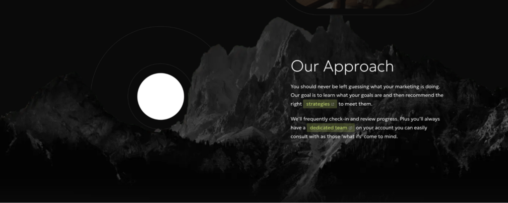
{31:19} As promised, the mountain and the moon on our website are not only a fun tool to play around with but also have meaning and intention behind them – just like everything else on our website.
The mountain represents rising above competitors and going the extra mile to be on top. However, the moon represents that we are always looking and reaching for something higher. So although we are putting our best work out there, there’s always room to achieve more.
Being able to explain the “why” to every rebranding component is going to be your biggest asset when it comes to defending the brand to your audience or your executive leadership. More often than not, someone is going to question a part of the brand or comment on a specific aspect. So if you can explain the meaning behind it and shed light on why you did what you did, there is more understanding.
Always Have Your Website 80% Completed
{34:55} When we say always have your website 80% complete, we don’t mean get 80% finished with your rebrand and then never finish it. What we mean is that you should always consider your website 80% complete.
So, even if it feels “finished” don’t just let it fend for itself. Keep tinkering with it, testing new things, and making small changes or improvements. The day our website launched, there was a laundry list of next steps and additions.
And trust us, people can tell when a website has been sitting without anyone taking care of it.
Our Favorite Parts Of The New Website
{44:30} The episode wouldn’t be complete without everyone mentioning their favorite parts of the new website. And we hope that you’ll share your favorite parts with us!
- Kimmick, “The Rising Mark” or Tower’s New Logo. The three pillars that represent our new logo resemble a tower. They’re three different heights to resemble “rising above” and have the idea that as the center mark grows, it brings people with it.
- Grace, The Elements of Storytelling. Our messaging slightly changed from elevating to rising above. This messaging pushes us forward and provides an additional sense of maturity of who Tower is. On the new site, we also incorporate current clients a lot more than previous designs. We want it to be known that our website is more for you, not us.
- Lily, The Folio. If you haven’t been on our site, the folio is an added feature that allows users to pick and choose services they are interested in and save them for later.
- Alex, The Shapes. The flow of the website doesn’t really include any sharp edges and you’ll see a lot of wavy lines and curved boxes that make you naturally flow from page to page.
To end this blog, we again want to give kudos to every Tower employee who had a hand in creating this new brand (we know there are a lot of you.) We’re super excited to continue to talk about the new features and start to live out the new messaging.
Check out the full episode: How To Elevate Your Brand
 By Marisa
  Kelly P
  Lily
Lily