Parallax Scrolling – What Is It?
- Web Design

When you hear the phrase parallax scrolling, what do you think of? The title of the next Star Trek movie? That’s exactly what I thought it was. When I was told that I was wrong, the next thing I said was, “Well then, what is it?”
Turns out, parallax scrolling is the next big thing in web design. Many companies have seen the benefit and the fun in these types of websites, including Tower Marketing. This trend began back in 2011 when Nike launched its website, “Nike Better World,” and it hasn’t stopped since. Basically, it is a scrolling technique in which background images move at different speeds than images in the foreground. This creates a 3D effect or an illusion of depth on your website.
Why Use Parallax Scrolling? – An Outsider’s Viewpoint
I say an “outsider’s viewpoint,” because I am in no way a designer or web developer. When I look at a website utilizing parallax scrolling, I am looking at it from the viewpoint of an end user. If I like the way a website uses parallax scrolling, it is because I thoroughly enjoyed the user experience. Parallax scrolling completely changes the way users interact with a website. Instead of simply scrolling from the top to the bottom of a flat, stagnant page, the user is taken on an eye-catching journey where shapes, pictures, and other animations morph on the screen and reveal new portions of the site.
This is all well and good, but let me reiterate the importance of user experience. Having a visually appealing site always puts points on the board, but if I’m scrolling through a beautiful website and it stutters, or I can’t locate a button to take me to the section of the site I’m looking for, then you have scored negative points.
Examples of Parallax Scrolling
Now that we have gone over what an outsider thinks about parallax scrolling, let’s look at a few examples of this trendy scrolling effect. I came across a list of 50 great parallax scrolling websites from 2014, and I have to say, some did not work well in my opinion. A few examples looked interesting, but they tended to lag on occasion. Their overall user experience was poor.
However, I did come across a few great examples of parallax scrolling (once again, this is my opinion as the end user):
1. Highway One

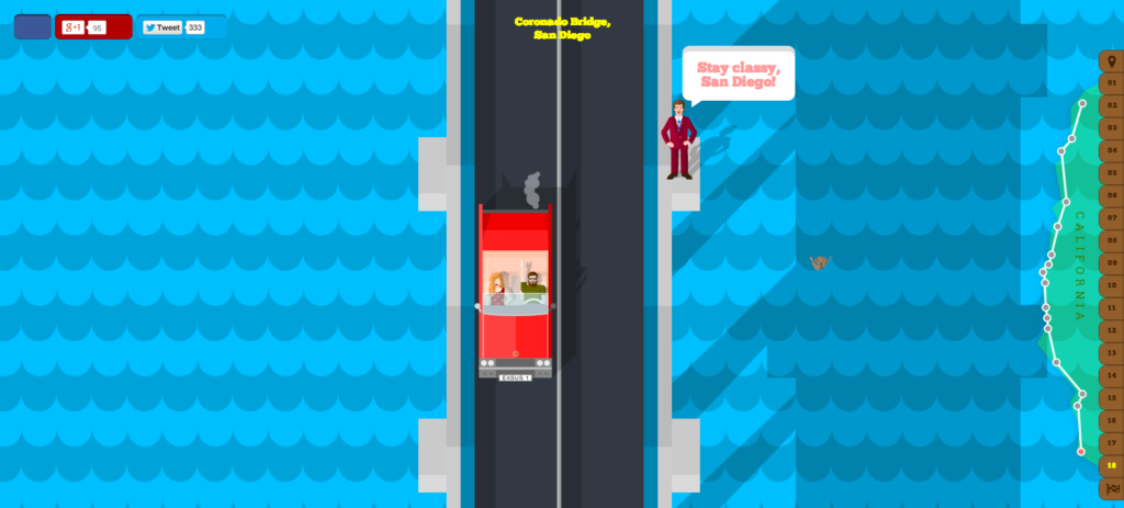
This website takes you on an animated car ride down the coast of California on Highway One. As you scroll, your vehicle passes through the many landscapes of California, all while providing instructions on what to do if you get lost. The tour includes radio stations in the area, facts, and cameos from the likes of Sean Connery as his character from the Alcatraz movie, The Rock, and Will Farrell as Ron Burgundy.

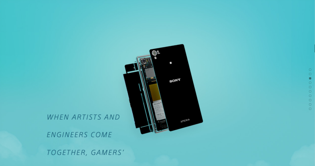
Sony’s site for their “Be Moved” campaign goes through many of its new products as they assemble themselves on your screen while you scroll. The animation can be a little bit choppy, but overall it provides a great experience. I played with this site for a while, as I watched how each small piece of technology came together to make their smartphones, cameras, and TVs.

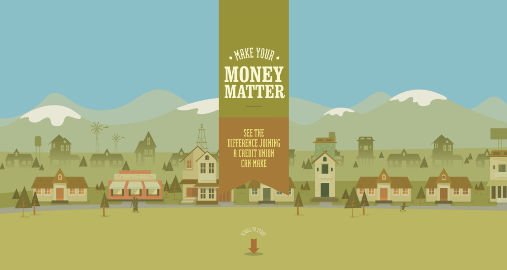
This website, done for Public Service Credit Union, also takes the user on a visual journey that flows well without any hiccups. It also does a great job of showing and telling the message, which is the importance of credit unions and how they can benefit someone. It finishes with a simple screen that tells you how to join a credit union in your area.
Do you have a website that utilizes parallax scrolling? Has it benefited your company? Tell us about your experience!
 Alex S
  Grace Z