My 3 Go-To Tools for Visual Content Marketing
- Content Marketing

The stats on including visuals in your content are staggering. 90% of information transmitted to the brain is visual. 40% of people will respond better to visual information than plain text. Posts generate 94% percent more views if you add compelling visual elements. In addition, all the major social media platforms are giving more prominence and exposure to posts that include a visual element.
If you’re design challenged (raising my hand!) and don’t have a design team at your disposal, I suggest these three tools for visual content marketing that will have you creating Twitter covers, blog headers, infographics, and incorporating top-notch photography like the true artist your 5-year-old self always thought you could be!

Canva
The beauty of Canva is that they offer templates for any kind of visual content you need to create. Whether it’s a Facebook or Twitter cover photo, Pinterest graphic, blog image or title header, or social ads, they offer numerous templates in a variety of styles. The pre-designed templates, allow you to simply tweak the copy to suit your needs or delete components down to a simple background image and then begin building a unique design.
As a tool for visual content marketing, I tend to use Canva not for template designs, but for smaller graphic pieces. Canva offers, what seems like, an unending supply of modern and quirky little icons, word bubbles, illustrations, photography, and holiday and seasonal images that make Clipart look ridiculously outdated. (Which it is. So please stop. Stop using it.)
There are so many free elements on Canva, but if you fall in love with a background or icon that does cost you something, you’ll find you won’t pay more than $1.

Piktochart
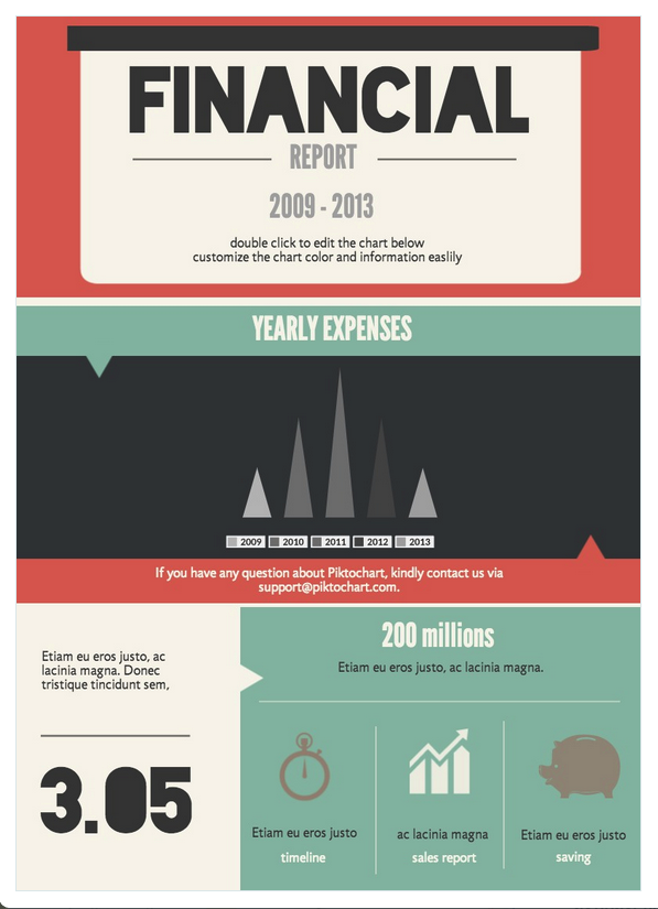
Piktochart is a lot like Canva, but instead of social media or blog images, they offer templates for infographics. They offer over 400 ready-to-use designs, although most of them fall under the Go Pro package ($29 per month/$290 annually). However, there are free themes available and I’ve always found something free that suits my needs. They are eye-catching and modern, and categorized for easy browsing. There is also a gallery of recently created Piktocharts to use as inspiration.
Although you’re starting with a pre-designed template, you can edit just about every element of the design. Change titles and body copy, colors, or images using editing tools that are easy and intuitive. You can even add or remove blocks of content to make your infographic longer or shorter as necessary. Start with a template comparing the benefits of tea and coffee and end up with a infographic comparing different student loan options.
What I like about Piktochart is that for a design illiterate like myself, I don’t have to worry about choosing colors and fonts that work well together. That’s all taken care of for me.

Death to the Stock Photo
I saw this slideshare shared on Google + not that long ago and I loved the ideas they shared on how to turn cold, generic, Stepford stock photos into something a little more edgy and interesting. In addition, I also stumbled across Death to the Stock Photo.
The site was started by two photographers who wanted to make their work available for friends who were writers, artists, freelancers, etc. Once you sign up on the site, a pack of stock photos is emailed to you at the start of each month. You don’t even have to think about it, it just shows up! You download the pack and the images are yours to use. Each month comes with a new theme – Wired, Slow Down, and Creative Space, are a few examples. Some months the images aren’t exactly a good fit for the clients I work with, while other months it’s a total jackpot!
They also have a Premium service, where in addition to the monthly pack, you also have access their library of over 400 images for $20 per month.
Share your go-to tools for visual content marketing! Or if you want to add visual content to your marketing strategy, contact our team!
 By Kelly H
  Grace H