HTML Email Best Practices: Are Image-Only Emails Bad for Marketing?
- Email Marketing & Automation
- UX

Successful businesses put a high priority on enforcing their brand standards—and rightfully so. It’s a visual representation of the relationship they have with their customers, and they maintain that rapport by always using the same fonts, colors, logo, and image styling.
That’s why it can be so jarring when you begin crafting an email marketing strategy for your client only to realize you’re limited to web-safe fonts, can’t easily overlay words on images, and can’t control the exact appearance of text because padding or margins vary by inbox.
Because of this, you may be tempted to create an image-only template so your email always looks exactly the way you want it to. Unfortunately, this is a short-sighted strategy that is likely to cause more problems than it solves. Keep reading to learn why (and what you should be doing instead).
Why You Should Avoid Image-Only Emails
Sadly, the benefits of image-only emails do not outweigh the drawbacks. Below are just a few of the reasons you should be avoiding them.
They Can Cause Deliverability Issues
When it comes to crafting your email campaigns, your top priority should always be deliverability. Image-only emails are often sent straight to the spam folder because they can be a tactic used by scammers to circumvent text filters put in place to detect offensive or deceptive wording.
The overall file size of your email also affects deliverability, as shown in this email on acid article, and image-only emails are much larger than HTML emails.
They May Be Slow to Load—or Not Appear at All
Some email clients may have images turned off by default for security reasons or to protect users from potentially offensive content or malware. If you’ve created an image-only email, they may see nothing but a wall of broken image icons, like the examples shown in this litmus article about image blocking.
Image-heavy emails can also greatly increase the amount of time it takes for the email to load, which can be detrimental to user engagement. People spend an average of 10-13 seconds reading an individual email; this means if there’s any lag time while images load, the already narrow window of opportunity you have to get your message across will shrink even further.
They Compromise Accessibility
Visually impaired people will have a much more difficult time using a screen reading device to interpret an image-only email. Although images in an email should always have descriptive alt text relevant to the email content, they are not meant to replace the email text entirely.

They Aren’t Optimized for Mobile
If you design an image-only email for desktop, your customer will be squinting to see it on their mobile device. On the other hand, if you design it for readability on phones, it will look cartoonishly large on a computer screen.

They Aren’t as Searchable as HTML Emails
If you send an email with information a contact wants to reference later, like a coupon or upcoming event, they will have a harder time searching their inbox for your message if all the text is image based.
Now that you’re aware of all the reasons why you shouldn’t create image-only emails, here are some best practices to keep in mind when crafting beautiful and effective HTML emails.
Best Practices for Creating HTML Emails
Does this mean you should avoid having images in your emails? Not at all! Most resources suggest a 60/40 text-to-image ratio for the best balance of deliverability and an optimal user experience. Try these strategies for creating emails that make an impact with or without images showing.
Reduce the Size of Your Images as Much as Possible
You can—and should—still include images in your email, but their file size should be minimized before adding them to your email template.
To export your images for an email from Photoshop, select File > Export > Save for Web. For opaque images like photographs, the JPEG file format will allow for a smaller file size than PNG. For illustrated images like logos that require transparency, PNG is the ideal option.
If you don’t have access to Photoshop, a free online image compression tool like tinypng can help keep your image sizes to a minimum.
Use Live Text
In the majority of cases, all email wording should be HTML text that can be selected with a cursor and read by a screen reading device. Although the original list of web-safe fonts are your safest choice, some inboxes may display your font (for example, Gmail will show Google Fonts).
You can always opt to use your brand font first with web-safe fonts as a fallback. By using commas in CSS, you are telling the inbox to use the first font if possible, then the second if possible, and finally any other sans-serif font if the other two aren’t available.
Create Bulletproof Buttons
A bulletproof button is any email button created using HTML instead of an image. They can be made using several methods including padding, borders, or Vector Markup Language (VML).
This bulletproof email button creator can help you easily create a stylized button that will display beautifully in most inboxes, including Outlook.
Swap Images for Gifs for Maximum Impact
You may be surprised to learn that an animated gif can be even smaller in file size than a photograph. It all comes down to the complexity of the image and how many pixels change between frames.
This article provides several detailed strategies for creating reasonably sized gifs for your emails. Some of these tips include:
- Cutting instead of fading for transitions
- Using illustrated vector elements instead of photos
- Using an overlay to limit the color palette
Include a “View in Browser” Link at the Top of Your Email
Some users will prefer to have images turned off by default, or they may not be able to control this feature because they have a workplace inbox with built-in security features.
This is why it’s always a good idea to include a “view in browser” link at the top of your email so the contact can see the email as it was originally designed.
Use Text Elements Instead of Image Icons
Experiment with text-based/CSS elements in place of images when possible. For example, instead of creating an image of an arrow, see if there is a web-safe font that includes one. You can google “ASCII” or “Unicode” followed by your keyword to check. This chart shows all the symbols you may not have known were part of the Arial font family.
Make Images an Optional Accent Element
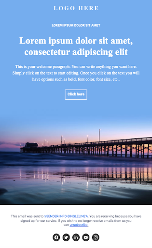
A recent trend we’ve noticed is emails that use images to blend seamlessly into solid-colored backgrounds. This gives the illusion of an image-only email while retaining the HTML text and responsive design for desktop and mobile.

Although you may not have the option of your ideal fonts and layout, a well designed HTML email is still a highly effective marketing tool that can be used to reach every one of your patrons—regardless of their demographic group or physical capabilities.
Do you need help creating artfully optimized email templates? Our email marketing team is ready to assist you in creating the best possible inbox experience for your customers.
 By Danae