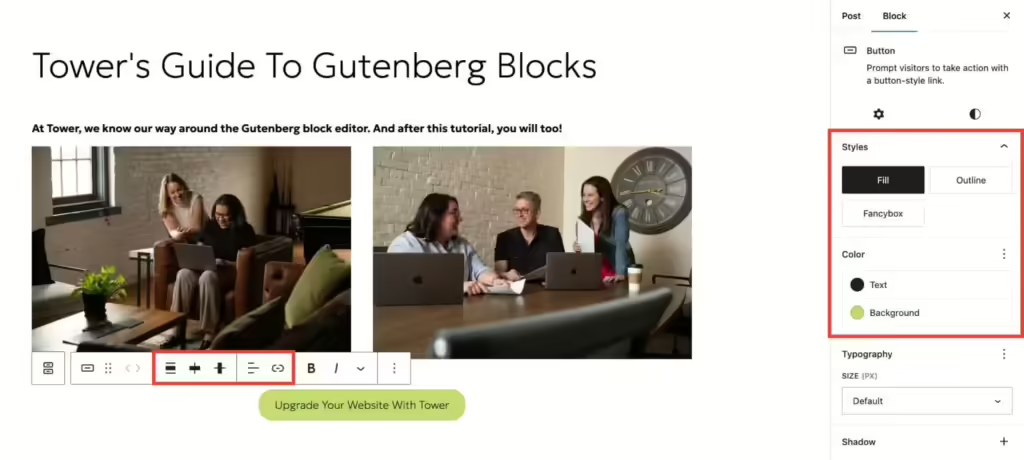
Color is a powerful tool. It affects mood, catches attention, and can be used to influence purchase decisions both positively and negatively. However, people don’t perceive color the same way.
Roughly 2.2 billion people around the world have a specific visual impairment that interferes with how they process colors. This makes it difficult to access or understand information portrayed by color alone.
By creating an accessible color palette that’s easy to read, you can design a website that is both aesthetically pleasing and easy to navigate for everyone.
Let’s explore how you can use website color palette accessibility to your website’s advantage.
Why Website Color Palette Accessibility Matters
Color accessibility is about creating color palettes and combinations that are visible to people with visual impairments, like color blindness or vision loss. Designing for color accessibility means creating inclusive websites where color combinations are clear to your audience.
This results in websites that are easier to navigate and understand, ultimately providing a superior user experience while meeting regulations.
Accessible color palettes benefit those without disabilities as well. For example, adults with age-related vision changes or those reading on low-resolution screens can benefit from an accessible color palette. Also, people who are in bright sunlight or dimly lit environments can still read content if it has the right color scheme and enough contrast.
You might hear someone ask, “Is there a universal color for accessibility?’ While there isn’t a single universal color for accessibility, black text on a white background is considered to be the easiest for people to read. However, this blog will equip you with more options than that you can create a color palette that fits your brand and serves your site users well.
1. Understand ADA Compliant Colors
Understanding ADA compliance and website colors can be tricky. Unfortunately, it’s not as simple as a checklist you can reference when building your site. The law only states that you must provide “reasonable accessibility” to people with disabilities, like the ability to use a screen reader and fill out forms.
Although it isn’t a legal standard, most developers and designers follow the Web Content Accessibility Guidelines (WCAG 2.0), which include three levels of compliance: AAA, AA, and A.
Accessibility consists of more than color, but we’re going to focus on which level your site would fall into based solely on your use of color.
WCAG Levels of Accessibility
If you’re working on a new website or a website redesign, knowing the differences of each WCAG level can help make the design process easier.
Level AAA
This is the strictest level of compliance. Level AAA is often used by government agencies, medical providers, and organizations that receive taxpayer funding. Level AAA requires a higher contrast level of at least 7:1 for normal text and images and a 4.5:1 level for large text.
Level AA
This is the medium level of compliance. For the majority of companies, level AA provides a good balance between meeting the legal requirements for usability and still giving designers flexibility. Level AA color guidelines require normal text and images to have a minimum color contrast ratio of 4.5:1 and large text to have a contrast ratio of at least 3:1.
Level A
This is the lowest level of compliance and is not recommended in terms of color. Color combinations that fall below levels AA or AAA will be considered a “fail” by color-checking tools.
How Compliance is Determined
Your design’s level of color compliance depends on two factors: the contrast ratio between the foreground (text) and the background, as well as the point size of your text.
A contrast ratio of 7 or higher is considered AAA compliant, while 4.5 through 7 will meet AA standards.
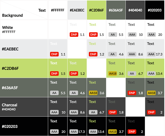
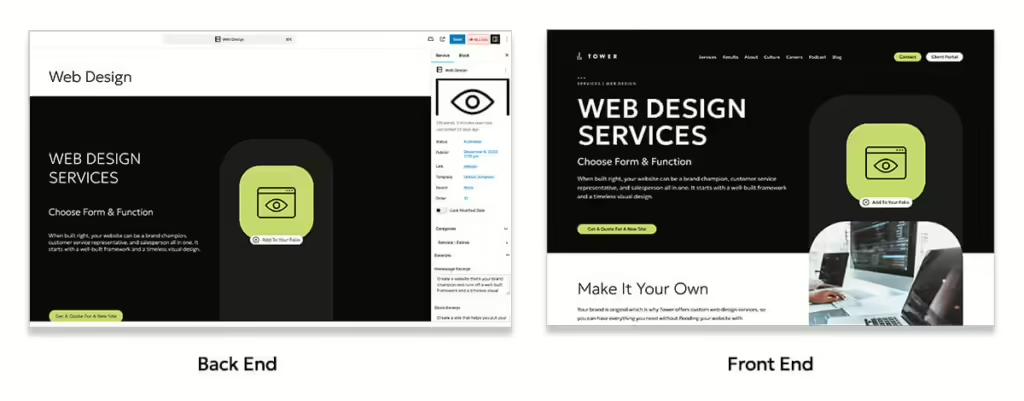
An example of a color contrast checker using Tower’s brand colors.
Some color combinations will be AA18 compliant, meaning they are readable at 18px (or 14px bolded) and above. If you do choose to use “borderline” complaint colors like these, however, you should take into account that text may scale down for mobile and no longer meet this size threshold.
Of course, there are exceptions to every rule. If your client is using a font that’s unusually tall or narrow, you may need to find a contrast ratio even higher than the AA minimum.
If you need to redesign or update your website to be ADA-compliant, our team of designers and developers is ready to help.
2. Check Colors for Accessibility
To ensure your colors meet accessibility standards and are ADA-compliant colors, follow these simple steps:
Use a Contrast Checker Tool: Input the hex codes for text and background colors, or upload your design to a tool like:
Test Your Design: Whatever tool you use will provide a contrast ratio and indicate if your design meets WCAG guidelines.
Adjust Colors for ADA Compliance: If the ratio doesn’t meet the requirements, adjust the colors by darkening or lightening one shade until the ratio improves.
Set a Target Ratio: Aim for AA compliance (4.5:1 for normal text). For higher levels of accessibility, aim for AAA compliance (7:1).
Preview and Save: Once the colors meet the necessary ratio, preview how they look in your design and save them for future use.
3. Use These Practical Tips for Better Website Accessibility
Envision Your Audience’s Journey: Before you start designing a website, make sure it’s built with all users, including people with disabilities, in mind from the beginning. It is easier to build the website correctly the first time, envisioning all audiences, than to go back and fix each issue.
Use Colors Consistently: You’re likely using the same color palette for your entire brand, including your website. If not, you should be. Maintaining a consistent color palette across your website and social media is important for cohesive branding.
Think of Colors on All Platforms: Remember that your brand colors will appear not only on your website, but they’ll also be in all your advertising, like your social media. So the contrast is as important there as it is on your website for a positive user experience.
Check Your Combinations: Anytime you change your color palette or want to try out a new combination, make sure you check the ratio first. I know—it’s a bummer to fall in love with a color pairing or palette only to find that you have very few or no combinations that are suitable for website accessibility.
Keep Learning: If you’re responsible for designing and maintaining your website, and you don’t have any outside support, keep researching and learning. Take the time to educate yourself on website accessibility beyond color contrast to help give yourself a well-rounded picture.
As a general rule to remember, organizations should design their sites to at least meet Level AA recommendations. But remember: the higher the contrast ratio of your accessible color scheme, the more accessible it is.
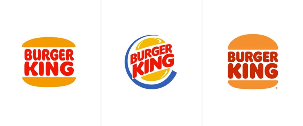
Sometimes, companies will hesitate to update their brand colors because it can be overwhelming and change all their work. However, that’s not always the case.
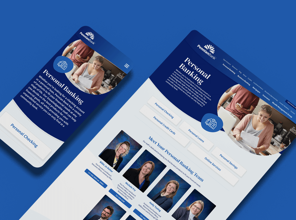
For this Tower client, minor adjustments to their existing red and black tones gave us twice the AA and AAA-compliant background and text color combinations.
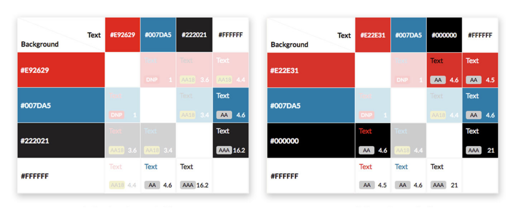
Luckily, these are minor tweaks that can make a website fully accessible. Even slight alterations to a color palette can give you more viable background and text color combinations, making for a more dynamic and engaging site.
Why We Create Stylish & Functional Designs
Designing through the new lens of accessibility can be frustrating at times, especially when working within an existing brand’s color scheme. It can be easy to get excited about a new design, but we need to remember that websites need to be both usable and beautiful.
Having an accessible color scheme might seem like a small detail, but the contrast between the text and the background on your website can significantly impact how people perceive and interact with your content. When we use accessible color palettes, it makes the Internet a more accessible place and a positive experience for everyone. At Tower, we consider visual accessibility, specifically accessible color palettes, essential for every site we build.
If you need to redesign or update your website color palette accessibility, our team of designers and developers is ready to help.