Color is a powerful tool. It affects mood, catches attention, and can be used to influence purchase decisions both positively and negatively. However, people don’t perceive color the same way.
Roughly 2.2 billion people around the world have a specific visual impairment that interferes with how they process colors. This makes it difficult to access or understand information portrayed by color alone.
By creating an accessible color palette that’s easy to read, you can design a website that is both aesthetically pleasing and easy to navigate for everyone.
Let’s explore how you can use website color palette accessibility to your website’s advantage.
Why Website Color Palette Accessibility Matters
Color accessibility is about creating color palettes and combinations that are visible to people with visual impairments, like color blindness or vision loss. Designing for color accessibility means creating inclusive websites where color combinations are clear to your audience.
This results in websites that are easier to navigate and understand, ultimately providing a superior user experience while meeting regulations.
Accessible color palettes benefit those without disabilities as well. For example, adults with age-related vision changes or those reading on low-resolution screens can benefit from an accessible color palette. Also, people who are in bright sunlight or dimly lit environments can still read content if it has the right color scheme and enough contrast.
You might hear someone ask, “Is there a universal color for accessibility?’ While there isn’t a single universal color for accessibility, black text on a white background is considered to be the easiest for people to read. However, this blog will equip you with more options than that you can create a color palette that fits your brand and serves your site users well.
1. Understand ADA Compliant Colors
Understanding ADA compliance and website colors can be tricky. Unfortunately, it’s not as simple as a checklist you can reference when building your site. The law only states that you must provide “reasonable accessibility” to people with disabilities, like the ability to use a screen reader and fill out forms.
Accessibility consists of more than color, but we’re going to focus on which level your site would fall into based solely on your use of color.
WCAG Levels of Accessibility
If you’re working on a new website or a website redesign, knowing the differences of each WCAG level can help make the design process easier.
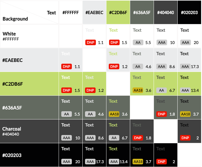
Level AAA
This is the strictest level of compliance. Level AAA is often used by government agencies, medical providers, and organizations that receive taxpayer funding. Level AAA requires a higher contrast level of at least 7:1 for normal text and images and a 4.5:1 level for large text.
Level AA
This is the medium level of compliance. For the majority of companies, level AA provides a good balance between meeting the legal requirements for usability and still giving designers flexibility. Level AA color guidelines require normal text and images to have a minimum color contrast ratio of 4.5:1 and large text to have a contrast ratio of at least 3:1.
Level A
This is the lowest level of compliance and is not recommended in terms of color. Color combinations that fall below levels AA or AAA will be considered a “fail” by color-checking tools.
How Compliance is Determined
Your design’s level of color compliance depends on two factors: the contrast ratio between the foreground (text) and the background, as well as the point size of your text.
A contrast ratio of 7 or higher is considered AAA compliant, while 4.5 through 7 will meet AA standards.
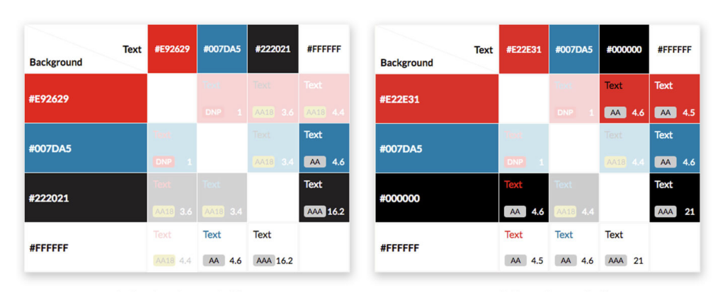
An example of a color contrast checker using Tower’s brand colors.
Some color combinations will be AA18 compliant, meaning they are readable at 18px (or 14px bolded) and above. If you do choose to use “borderline” complaint colors like these, however, you should take into account that text may scale down for mobile and no longer meet this size threshold.
Of course, there are exceptions to every rule. If your client is using a font that’s unusually tall or narrow, you may need to find a contrast ratio even higher than the AA minimum.
If you need to redesign or update your website to be ADA-compliant, our team of designers and developers is ready to help.
Test Your Design: Whatever tool you use will provide a contrast ratio and indicate if your design meets WCAG guidelines.
Adjust Colors for ADA Compliance: If the ratio doesn’t meet the requirements, adjust the colors by darkening or lightening one shade until the ratio improves.
Set a Target Ratio: Aim for AA compliance (4.5:1 for normal text). For higher levels of accessibility, aim for AAA compliance (7:1).
Preview and Save: Once the colors meet the necessary ratio, preview how they look in your design and save them for future use.
3. Use These Practical Tips for Better Website Accessibility
Envision Your Audience’s Journey: Before you start designing a website, make sure it’s built with all users, including people with disabilities, in mind from the beginning. It is easier to build the website correctly the first time, envisioning all audiences, than to go back and fix each issue.
Use Colors Consistently: You’re likely using the same color palette for your entire brand, including your website. If not, you should be. Maintaining a consistent color palette across your website and social media is important for cohesive branding.
Think of Colors on All Platforms: Remember that your brand colors will appear not only on your website, but they’ll also be in all your advertising, like your social media. So the contrast is as important there as it is on your website for a positive user experience.
Check Your Combinations: Anytime you change your color palette or want to try out a new combination, make sure you check the ratio first. I know—it’s a bummer to fall in love with a color pairing or palette only to find that you have very few or no combinations that are suitable for website accessibility.
Keep Learning: If you’re responsible for designing and maintaining your website, and you don’t have any outside support, keep researching and learning. Take the time to educate yourself on website accessibility beyond color contrast to help give yourself a well-rounded picture.
As a general rule to remember, organizations should design their sites to at least meet Level AA recommendations. But remember: the higher the contrast ratio of your accessible color scheme, the more accessible it is.
Sometimes, companies will hesitate to update their brand colors because it can be overwhelming and change all their work. However, that’s not always the case.
For this Tower client, minor adjustments to their existing red and black tones gave us twice the AA and AAA-compliant background and text color combinations.
Luckily, these are minor tweaks that can make a website fully accessible. Even slight alterations to a color palette can give you more viable background and text color combinations, making for a more dynamic and engaging site.
Why We Create Stylish & Functional Designs
Designing through the new lens of accessibility can be frustrating at times, especially when working within an existing brand’s color scheme. It can be easy to get excited about a new design, but we need to remember that websites need to be both usable and beautiful.
Having an accessible color scheme might seem like a small detail, but the contrast between the text and the background on your website can significantly impact how people perceive and interact with your content. When we use accessible color palettes, it makes the Internet a more accessible place and a positive experience for everyone. At Tower, we consider visual accessibility, specifically accessible color palettes, essential for every site we build.
If you need to redesign or update your website color palette accessibility, our team of designers and developers is ready to help.
How do you find the best agency to make your marketing project come to life? With a lot of options out there, it can become overwhelming to decide on what organization to choose.
By creating an RFP for marketing services, you’ll be able to streamline the process and feel confident in your decision. The following blog outlines our top RFP best practices so you know you’re putting your best work forward.
An RFI (request for information) contains fewer questions than an RFP and is designed to help companies decide whether a particular vendor should be included in the list of vendors they send their RFP to. An RFQ (request for quotation) seeks specific, relevant cost details related to the product/service that is the subject of the RFP.
An RFP stands for Request for Proposal, and it’s a document that your organization will put together when you’re looking for a service that you can’t provide internally, or need additional assistance with.
Specifically, if we’re looking at an RFP for marketing services, it would be a document that highlights specific solutions your company is looking for. Then you’ll have the ability to send this document to any vendor you’re interested in getting more information from.
Benefits of Writing an Effective RFP
It can take some initial time and effort to write an effective RFP. But by putting in the work now, you’ll notice the time and cost savings down the road.
#1. Find the Most Qualified Companies
If you’re intentional about who you send your RFP to, you’ll create a sense of competitiveness and urgency within that vendor list. The vendors want to come out to be the best option for you, so they’re going to put their best foot forward.
In general, if your RFP is well-organized and clearly outlined with your goals and objectives, you’re going to get high-quality responses in return. So you can feel confident that you’re going to find a vendor that provides the finest service and is best suited for your project.
Also, as a bonus, the research you’re doing to find the most qualified companies for your project can stay on your vendor list for any future projects.
#2. Make Quick Comparisons Across Vendors
A key benefit of sending out an RFP is you’ll have the same attributes from all of your vendors. This allows you to have an apples-to-apples comparison. You can see the same services and how the price, expertise of the team, and timelines vary from vendor to vendor.
All your vendors answer the same questions. So, rather than going back and forth with emails or searching for answers on their websites, you’ll have everything right in front of you.
#3. Save Time in the Long Run
As we said previously, taking the time to write an effective RFP will take time and effort initially. However, you’ll also be saving a lot of time in the long run. Once the RFP is sent out, the selection process and meetings are streamlined.
What to Include in Your RFP For Marketing Services
Just like any other piece of writing, it’s crucial to find a balance between providing enough information to your vendors about the service you need and not over-fluffing your document with information that a vendor can easily find on your website.
In general, here are a few standardized items you should include according to our RFP best practices.
Company Overview
Point of Contact Information
Project Description & Goals
Agency Selection Timeline
Budget
Evaluation Metrics
Submission Requirements
Final Thanks
Look through a variety of marketing RFP examples to gain insights about what to include in your RFP document.
Sending Your RFP for Marketing Services
After you’ve completed your RFP, it’s time to send it out to vendors. It can be overwhelming to think about who to send it to, to ensure you’re getting the most qualified vendors to send you their information.
Our best recommendation is to do your research beforehand. Find a short list of vendors that align with your company’s goals, mission, and values. We recommend sending your RFP to 3 to 5 vendors.
Here are some questions to ask as you’re selecting your vendors.
How far away is the agency? Am I okay with working virtually with them?
Do the services they offer align with my project needs?
Do they have good reviews on Google and social media?
Have they completed similar projects to what I’m asking for?
Do their professional values align with ours?
As a maximum, you shouldn’t send your RFP to more than 7 vendors. If you send your RFP to too many vendors, it starts to get overwhelming and complicated to make a decision. It’s crucial to make sure you’re only sending the RFP to companies you believe would be a great fit to work with.
The Marketing RFP Selection Process
So you’ve written an effective RFP and you’ve received a list of vendors. It’s now time for the selection process. There are specific criteria you should be looking for as you’re reviewing the vendors.
Some criteria vary based on the purpose of your RFP and the goals of the RFP. However, a general rule of thumb is to look at the vendor’s reputation, pricing, timeline, and communication style.
In some cases, you’re going to be working with this vendor for a significant chunk of time, so although price is important, you should also be looking at the quality of work, testimonials, and their values. Ask yourself, what were others’ experiences working with the company?
By getting a full picture of what it would be like to work with the vendor, you can better understand their credibility and authority within the industry. You’ll have a real-world perspective and prediction of the working relationship moving forward.
Recommended Timeline
The exact timeline of your selection process depends on when you’re sending out the RFPs, and your capacity at the time. For example, if you’re sending an RFP out right before the end of the year, your timeline will likely be a little longer due to the holidays.
As a general rule of thumb, we recommend keeping the process, from start to finish, within a five-week timeline. That way, it’s not drawn out, additional questions don’t arise, and you can get your project up and running efficiently.
Week 1: Send out your RFP to 3 to 5 vendors.
Week 2: Review questions from vendors and conduct initial meetings.
Week 3: Vendors send their final proposals to you.
Week 4: Pick your final vendors and call their references.
Week 5: Meet internally and decide on what vendor to choose.
Questions to Ask in the Marketing RFP Process
In week 2, you’ll see that you should be answering your vendor’s questions and then scheduling initial meetings with them.
Below are a few questions we suggest using to get to know the vendor and their capabilities better.
Who will my contact person be?
Where are you located?
How long have you been in business?
How many clients do you currently have?
How many projects have you completed of a similar nature to mine?
How many employees do you have?
Do you outsource your work, or use consultants for any of your projects?
Some Final RFP Best Practices
Now that we’ve reviewed how to write an effective RFP for marketing services, questions to ask during the selection process, and a recommended timeline, we’ll provide you with some final RFP best practices.
1. Make sure you’re ready for the project.
Before you take the time to send out the RFP and get information from vendors, make sure your organization is ready to take on the project. Ask your leadership and project managers questions to ensure they can handle the workload and that a budget is approved.
2. Be specific about your project’s wants and needs.
In order to avoid road bumps during the selection process, be clear and specific in your RFP, and anticipate questions your vendors will have so you can include them in your RFP.
3. Make your RFP easy to read and understand.
Whenever possible, make bulleted lists and include headings so a vendor can easily read through your RFP to pick out the most essential information.
Opinions on this question vary, but we recommend using tables and lists wherever possible. Each of your questions should correspond with a specific section to keep things organized. Make sure you leave space for the vendor to reply!
4. Your RFP should not replace a one-on-one meeting.
An RFP is beneficial to streamline the selection process, but it shouldn’t replace an initial meeting with a potential vendor. The one-on-one meeting is crucial to get the full picture understanding of that vendor.
5. Evaluate your RFP responses with a scaling system.
Your selection criteria will vary, but no matter what you should create a scaling system so you can equally evaluate all responses. Define what your most important characteristics are as you start to select your vendors and then rank each vendor for that characteristic.
We recommend using a scoring system to evaluate RFPs. Score the responses you receive on a scale from 1-5 or 1-10. This helps you make more apples-to-apples comparisons so you get the best value for your money.
6. Don’t make cost the main focus of your RFP.
Although cost is a valuable factor as you make the decision, it shouldn’t be the main focus. Think of it as a three-legged stool, without equal factors, your project may become unbalanced. Ideally, you should consider the three following characteristics.
Speed. How long will the project take?
Cost. How much will the project cost?
Quality. Will you be happy with the result?
We follow the good, fast, and cheap method. You’re likely only going to get 2 out of these 3 characteristics. So if you want something fast and cheap, it’s likely not going to be very good.
7. Only ask for references from your top vendors.
Your vendors are going to be asking clients to be a reference for your RFP. This is a big ask and it takes time out of a client’s day to have the meeting or phone call. So, as an RFP best practice, we recommend only asking your top vendors for references so your interactions are more valuable.
8. Notify the vendors that didn’t get the job.
The vendors work hard to put together a proposal and that also takes time and effort. As a courtesy, let vendors know when they weren’t chosen so they aren’t left waiting around.
Ensure you’re finding the right vendor for your services by providing a clear understanding of your project and following our RFP best practices.
This blog was originally published on October 22, 2019, and was updated on September 8, 2023.
If you manage a business, then you’re familiar with the phrase “Cash is King”—the notion that liquid funds are the most important asset of a healthy company. But we also live in an attention economy, where people’s time and focus are their own form of currency.
When we’re all vying for visibility, it can be tempting to view rebranding as a quick and easy way to recapture the awareness we’ve lost to our competitors.
Before you start sketching logos and picking Pantone colors, however, it’s vital to ensure you’re not making changes on a whim that will harm your business in the long run.
Once you’ve established that you are in the right position to rebrand, you can use our comprehensive rebranding checklists to make sure you don’t miss any key steps.
How to Determine if a Rebrand is Right for Your Organization
A new identity has plenty of benefits, but only if you’re doing so for the right reasons.
Necessary Reasons to Rebrand
There has been a significant upheaval to your company’s structure, like an acquisition, merger, or division.
There have been major changes to your products or service offerings.
The market or industry has altered drastically in a way that puts your current brand at a disadvantage in comparison to your competition.
Your company is fighting for digital real estate due to another company with a similar name or identity.
Unnecessary Reasons to Rebrand
New leadership or management is pushing to rebrand your business.
Other players in your industry are rebranding.
Your company wants to generate buzz amongst your target audience.
Your organization is trying to divert attention from a larger issue like internal turmoil, a public relations crisis, bad positioning, or an outdated product.
Attempting to rebrand during one of these scenarios may hurt your reputation, and many of these issues can be resolved through improved communication, investing in product development, or creating a new targeted campaign.
Types of Rebranding Strategies
After you’ve determined a rebrand is right for your business, the next step is to decide how many aspects of your branding need to change. There are numerous ways to implement a rebrand, from a simple logo tweak to a fresh visual identity and brand standards.
After answering these questions, you can better gauge whether a full or partial rebrand will best suit your goals:
Does your situation require a new moniker or just a logo?
Do you need a revised visual identity, or can a new logo work with your existing colors and fonts?
Are there elements that absolutely must stay, like trademarked messaging or a font you’ve bought the license to?
Are you and your stakeholders open to starting from scratch?
Full Rebrand
Are you ready to start fresh with a new name, logo, and tone of voice? It may be time for your company to completely reinvent itself and drop any association with its prior identity.
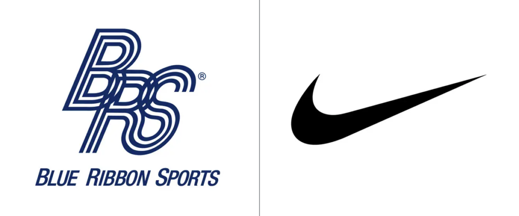
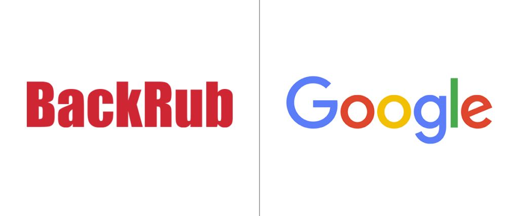
Corporations often go through a full rebrand early in their existence—so early that the majority of their current customer base wouldn’t know their original name. You’ve probably never heard of Blue Ribbon Sports or BackRub, but you’ve surely heard of Nike and Google.
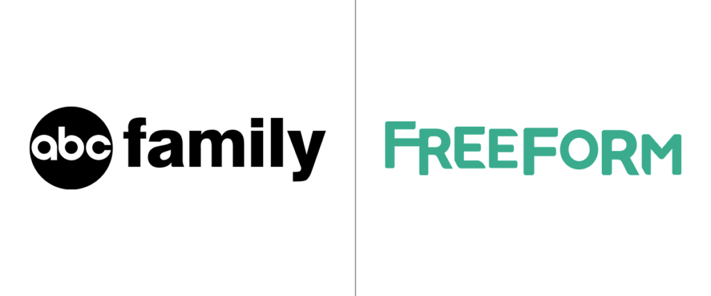
Full rebrands may also be necessary later in an organization’s life when its business objectives change. When ABC Family was no longer a fitting name for the content the cable company was producing, they opted for the more modern name Freeform.
Brand Refresh
A visual refresh is a less intensive way to rebrand and can be done more gradually rather than all at once. It involves updating individual aspects of the brand such as colors, fonts, and/or the logo. It works well when your visual identity still fits the company but feels a bit outdated.
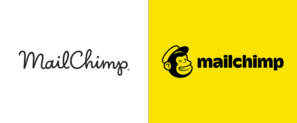
MailChimp had a strong brand refresh in 2018, trading its script wordmark for a chunky lowercase name that more prominently features their mascot, Freddie. They also made a splash by choosing bright yellow as their primary color.
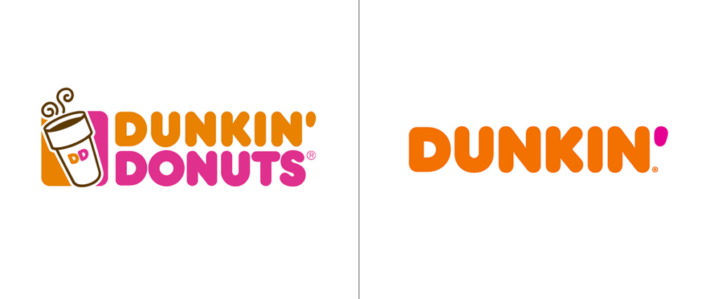
In 2019, Dunkin’ kept its rounded font but dropped half its name and the coffee cup icon. They also opted for a more vibrant orange.
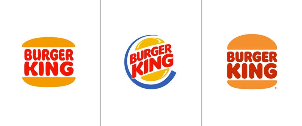
Burger King took a step back in time with their most recent logo (2021), referencing the round, bubbly, vintage-style design they used from 1969 to 1994.
Use this Rebranding Checklist to Plan Your Strategy
The final step in the process is to establish a rebranding launch strategy. Executing your plan with precision and attention to detail is what will set your new identity apart from your competition. That’s where having a reliable, proven rebranding checklist comes in!
To ensure your rebrand goes smoothly, it’s crucial to:
Set a timeline.
Identify branded pieces that will need to be updated.
Assign responsibilities to everyone involved in the project.
We’ve laid out all the steps your company should take in our series of rebranding checklists below.
Logistical & Legal Rebranding Checklist
The logistical aspect of the process can be so intimidating that companies put off rebranding, for years. Or, some companies get befuddled and stall while deciding what should be in their rebranding checklist. Fear not, with proper planning, you can space items out over time to make them less overwhelming.
Consider timing. Your accountant will thank you for planning around tax season.
Hire a lawyer to assist and catch any loose ends with business permits and trademarks for your local and state jurisdictions. (Every rebranding checklist should consider this point.)
Decide if you should be outsourcing to a marketing agency that can handle the logistics and provide a new perspective from outside your business.
Apply to trademark your new brand name, taglines, and/or new product names.
Obtain new URLs.
Visual Rebranding Checklist
Taking into account every graphical detail is what will make your new brand resonate with your target audience. With our visual rebranding checklist, you can develop a personalized and comprehensive plan for making every necessary update.
Establish a clear review and approval process for new branded pieces. It’s imperative to understand how they will be reviewed and who has the final say. Ensure this is in your rebranding checklist and you’ll avoid introducing confusion.
Get second and third opinions. If the rebrand is occurring internally, take the time to gather opinions from your audience. Your new brand needs to resonate with them, not you.
Create a new style guide for internal review that includes usage guidelines for the logo, fonts, and colors. Once you’ve established your updated style guide, this will be your guiding light.
Create a list of every item that needs to be redesigned. Start with urgent items and pieces that truly define the brand. Then, knock out smaller items like stationery.
Send out a new style guide and asset kit externally to relevant partners who need access to your logo and identity.
Internal
This is normally the last step of a rebrand, because you have the flexibility to make internal updates at a less accelerated pace. However, it’s still important to catch and remove every instance of your previous branding.
Schedule an all-hands meeting to share the new brand and its messaging internally, and pick a date for the following items to be updated:
Bills, checks, and other printed materials.
Phone systems, voicemail messages, and email footers.
Server and file names.
Computer logins.
Interior design and outdoor signage.
Think a rebrand is right for you? From guiding your staff through the process internally to augmenting your team to gain a fresh perspective, Tower can help! Contact us today to get started.
Editor’s note: This blog was originally published on February 20, 2019. It was updated on August 1, 2023.
If you work in business, you’ve probably heard the terms “marketing mix” or“the 4Ps of traditional marketing” at one point in time. But with the booming success we’ve seen in the digital marketing industry, have you considered how to integrate those concepts into your internet marketing strategy?
Learn how the digital marketing mix uses the 4Ps —plus 3 additional Ps — to master the nuances of successful online marketing.
The 4 Ps of the Traditional Marketing Mix
The traditional marketing mix is defined by Phillip Kotler as a “set of marketing tools that the firm uses to pursue its marketing objectives in the target market.” That “set of marketing tools” is what’s commonly referred to as the 4Ps.
The 4Ps are the foundation of any successful marketing plan. They include:
Product
Price
Place
Promotion
For years, the 4Ps have been the go-to model for building a marketing strategy. But, in the era of internet marketing, referring to only the 4 Ps can limit your brand’s reach.
According to WordStream by LocaliQ, 72% of marketing budgets are reserved for digital channels, increasing digital marketing’s share of advertising to 55%. With that increase, the concepts of product, price, place, and promotion also needed to grow.
The digital marketing mix is an expansion of Kotler’s traditional marketing tools. The 7 Ps of digital marketing include product, price, place, promotion, people, process, and physical evidence.
Defining The 7Ps of The Digital Marketing Mix
Let’s jump into defining the digital marketing mix and explaining how using these 7Ps can help you build on your existing approach to better reach your customers.
1. Product
Product refers to the ‘thing’ you offer that your target audience wants. This can be a physical, tangible item, or an intangible service. From clothing or water bottles to home insurance or a digital marketing agency, a product is the item or service the user seeks to fill a need.
If it helps, think of the product in terms of supply and demand. All consumers have wants and needs. You are in business because you offer something that is wanted or needed by a consumer. Your product supplies that consumer’s demand.
Focus on the Consumer First
A lot of businesses think they have a great product and then try to market it to the public and fail. Harvard Business School professor, Clayton Christensen, reports that over 30,000 new products are launched every year, only 5% of which succeed.
Most times, it’s because of poor market research. They have not asked the fundamental question: Why do people want this?
If there’s no need for your product, it won’t sell. Understand the consumer demand first and then design your product around that need. From there, identify your unique selling point (USP) that makes your product valuable to buyers and differentiates you from competitors.
Product Questions to Ask Yourself:
What does the customer want from my product? What need(s) does it satisfy?
What is my USP?
What advantages does my product offer to meet the user’s needs?
How do I differentiate my product/service from competitors?
Are there features a competitor product has that mine does not? Are there features that the consumer does not deem valuable or worth paying for?
Does my product have a name? How is it branded?
How do I intend consumers to my your product? Are they using it correctly? Where will they use it?
Answering these questions can help you understand the end user’s view of your product and can help drive additional marketing decisions because you understand what problem your product solves.
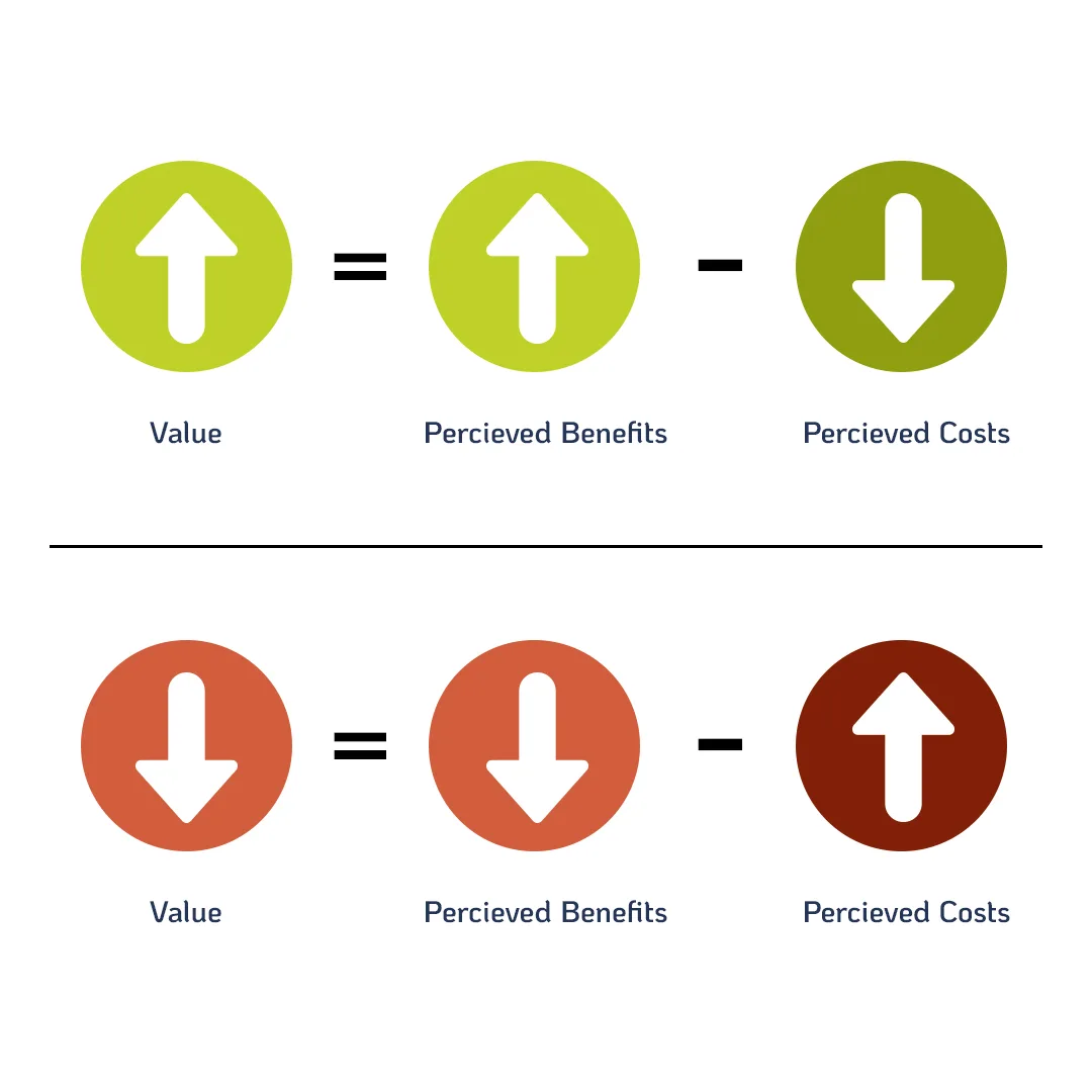
2. Price
Price is what the consumer is willing to pay for your product. While it’s a generally easy concept to understand, it can be tricky for many businesses to apply — prices that are too high push users to search elsewhere; prices that are too low cut into your profit margins.
Understanding your target audience and the relationship between perceived benefits, price, and value can help simplify the process. If perceived benefits increase or price decreases, the perceived value should generally go up. But if perceived benefits decrease or the price increases, the perceived value goes down.
If consumers don’t see any perceived benefits in your product, or if they decide the benefits aren’t worth the price, your product’s value will decrease and you’re less likely to make sales.
Opportunity Cost
Since a large part of the pricing model relies on what consumers perceive as valuable, your business needs to understand what the consumer feels they are losing out on by choosing your product over the others — also known as the opportunity cost.
Here’s an example: I have $350. I can spend it on Facebook ads that might generate leads, or I can use it on Google text ads. If I spend the money on Google ads then I forfeit the opportunity Facebook ads might bring in. The loss of those potential Facebook leads is the opportunity cost.
In this situation, I have to make the decision of what I find more valuable. Will Google or Facebook get me the leads I need? Which is the most cost-effective? Which is easier to manage? Where is my target audience most likely to be?
Your customers will ask themselves similar questions before making a purchase: will this product make my life easier? Am I getting my money’s worth? If you can anticipate those opportunity costs, you can use them to your advantage to choose a price that’s appropriate in your market.
Factors That Affect Product Pricing:
There are so many factors that can impact the price of your product, some of the most common including
Competitive offerings and prices
Market share
Product branding and quality
Materials or input costs
Customers’ perceived product value and fair price.
Depending on the factors that are most important to you and your target market, you can price your product appropriately using one of the following approaches:
1. Demand-oriented pricing: set the price based on the demand for the product or service. If demand is high, consumers might be willing to pay more for the product.
2. Cost-oriented pricing: consider how much it costs to make your product and markup accordingly so you see a profit.
3. Profit-oriented pricing: determine your business’s profit goals and test out prices that yield your desired return on sales (ROS).
4. Competition-oriented pricing: price your product similarly to your competitors to compete with their market share.
Pricing Questions to Ask Yourself:
What is my product’s perceived value in the eyes of the consumer?
What is the lowest cost I can charge while still selling enough to be profitable?
Is my target market price-sensitive? What effect will changes in price do in the marketplace?
Should I increase or lower the price?
Are my prices competitive?
Don’t forget to also consider making adjustments to your price. Seasonal discounts, trade-in deals, and other cost-saving measures can prove to be successful in many markets. Make sure you have a plan in place to monitor your price to handle the ebbs and flows of demand.
3. Place
Place refers to where the consumer is able to purchase your product. It solves the complicated process of getting the product from the manufacturer into the hands of buyers.
Traditionally, place referred to strictly brick-and-mortar locations. But the internet has added some complexities to this principle of the digital marketing mix, opening the door for many more distribution channels to meet consumers where they are.
Ecommerce sites can be an incredibly useful place to sell your product. In 2021, retail eCommerce retail sales exceeded $5 trillion US dollars globally — a number that’s projected to rise above $8 trillion by 2026.
If your site is lacking online retail capabilities or you’re not selling your product through third-party marketplaces online, you’re limiting your place strategy. It’s one of the easiest ways to increase your brand’s reach.
Places and Accessibility
Smartphones (and the internet in general) allow the consumer to have a 24/7 marketplace accessible from anywhere at any time. It is critical that your brand exists in the digital space. Not only that, your business should easily found and active in that space.
Examples of Online Places Include:
Websites displaying interactive ads
Search engines highlighting shopping ads
Google search results
Emails
Social channels such as Facebook, Instagram, or Pinterest
Making your products accessible to the users at a time and place that is most convenient to them will give your business a competitive advantage.
Place Questions to Ask Yourself:
Where is my target market searching for products? Are consumers looking in brick-and-mortar stores? Online? Direct sales?
Do I have access to the medium or channel? Do you have expertise and knowledge of how these channels perform? Can I optimize the efficiency of these distribution channels?
Where are my competitors most active? Where do they push their products? Are they utilizing a channel that I‘m not?
Because there are so many more “locations” or channels for the consumer to find your product, deciding on the placement of your product can be a challenge. It’s crucial that you get to know your target audience to determine which distribution channels are most likely to convert into a lead or sale.
4. Promotion
Jim Blyth defines promotion as “the marketing communications used to make the offer known to potential customers and persuade them to investigate it further.” Simply put, it’s your strategy for getting people to notice your product or service.
Thanks to modern technology, businesses have more channels than ever to communicate through. A few examples can include Google My Business listings, sponsored ads, Instagram posts, email newsletters, and much more.
These tools can help your brand personalize your marketing by tailoring your message to a specific user. Using GA4 and consumer engagement reports, you can even determine where your audience is most active and segment them according to mobile devices, browsers, and operating systems.
Which Channels to Use
When deciding on distribution channels, it’s important to make sure it fits your audience and your brand. Here are some major online distribution channels:
What potential channels are available to communicate my message?
Where are my competitors promoting their products or services? Where are they active that we’re not?
Which is the most effective channel to communicate through?
What is an appropriate cadence for our promotion?
How you choose to promote your product or service can make all the difference in converting leads into sales.
5. People
In the digital marketing mix, people refers to anyone who represents your product and comes in contact with the consumer. Aside from your customer service team or sales force, people can include your employees, business partners, or anyone that consumers associate with your brand.
It’s important you’re hiring people who understand your brand’s vision and believe in your goals. You should be able to trust that when they come in contact with customers, they’re representing your brand in a positive light.
This is increasingly important if your brand is on social media.
Social Media Relationships
Social media, online forms, emails, and other internet platforms have created a way to interact with customers directly. These added relationship factors give your brand the ability to:
Respond quickly to users asking questions on Facebook, Instagram, Reddit, etc.
Add insightful recommendations via Quora
Respond to negative reviews on Google Reviews or Yelp
Businesses that are utilizing these platforms can leverage the power of relationship-building where customers are active. Interacting with your customers directly on these platforms can strengthen trust and keep consumers coming back to your brand.
People Questions To Ask Yourself:
Do my employees understand our brand identity?
Do my business partners understand our company goals?
Have I set clear expectations for my employees to follow when interacting with customers?
The bottom line: your people represent your brand. How they interact with customers can make or break their perception of your product or service.
6. Process
Process is defined as the core tasks and operations required to deliver the product or service to your customer. This can refer to anything from logistics and shipment and delivery to wait times and check-out processes.
If your customers find your processes to be too complicated — for instance, the time from placing an order to receiving it is too long — you’re likely to lose out on future sales.
To optimize your processes and create the best experience for your potential customers, it’s critical to understand the user journey. If you can simplify the sales funnel and make the process from initial brand discovery to purchasing feel natural, the greater your chances are to convert.
Process Questions To Ask Yourself:
How easy is it to navigate through our website? Is it easy to make a purchase online?
How long are our delivery times? How does this compare to competitors?
Do we have enough staff to cover the amount of purchases/requests being made?
Are there any internal process barriers keeping us from delivering customer value?
Have our customers complained about our process? Where are they dissatisfied?
Listening to customer feedback can be a really useful tool for defining your process strategy. Take customer complaints as an opportunity to reevaluate your current process and strategize how to fix it.
7. Physical Evidence
The final P in the digital marketing mix is physical evidence. It’s the proof that your product or service exists and is credible. In the online universe, your brand’s digital footprint can serve as your physical evidence.
Your website is the most important measure of physical evidence for most people. If it’s up-to-date and easy to navigate, your brand can seem more trustworthy.
Personal touches like thank you notes, confirmation emails, and receipts after a purchase can be another piece of physical evidence to keep your brand top-of-mind for customers.
Additionally, it’s important your brand is represented on social media. You should be prioritizing creating solid brand awareness across multiple platforms and channels. Existing on these platforms and staying active can build credibility.
Physical Evidence Questions To Ask Yourself:
What post-purchase procedures do we have in place? Is there anything we could improve on?
Are we represented across multiple channels? Is our branding consistent across each?
Does our website provide a positive first impression? Is the UX positive?
Are we actively responding to customers on social media or via email?
The more time you spend expanding your message across multiple channels and platforms can greatly increase the value the customer finds in your brand, product, or service.
An Integrated Marketing Approach is Best
Increase your share of voice by choosing an integrated marketing approach. When you start using the 7Ps of the digital marketing mix, you can multiply your reach using a consumer-centric strategy.
Digital Marketing Mix Checklist
Identify the product or service. What is the Unique Selling Proposition (USP)?
Research and understand your target audience. Who are your potential customers? What do they search for? Is your product relevant to their needs?
Research and understand your competition. Is the market highly competitive or are you a pioneer? What can you learn from other businesses competing in this space?
Assess the channels (space) where your customer engages with your product. Understand the pros and cons of each platform/place.
Test your digital marketing mix. Ask customer-focused questions:
Does the product meet the user’s need(s)? (Product)
Is the pricing right? Or does it need to change? (Price)
Where are the consumers? Are your marketing channels delivering as expected? (Place)
Is your marketing message resonating with the target audience? Do they understand? Do they feel confident in making a purchase? (Promotion)
Do my employees positively represent our brand? (People)
Is it easy to purchase and receive our product/service? (Process)
Can we be found across multiple marketing channels? (Physical Evidence)
Review your marketing plans & adjust each of the elements to cater to your user, market, and business needs.
Need help implementing an integrated approach to your marketing plan? Our digital marketing team has been solving that problem for our clients for over 25 years. Contact our team for a consultation.
Editor’s note: This blog was originally published on June 16, 2020. It was updated on July 28, 2023.
One of the first things a consumer will notice about your brand is your logo, which makes it so much more than just a symbol. It’s a visual depiction of your brand to help make it stand out and more easily recognizable.
However, you’re probably aware the biggest challenge of a logo is how easily it can be dated. If you’re thinking about redesigning yours and want a fresh look, this blog will help you understand the current logo design trends of 2023.
But more importantly, in the end, you’ll walk away with some tips on how to create a timeless logo that won’t become dated fast. And how to make a new one that represents your business well.
Trend #1: The Minimalist Logo
We’ve all heard the saying ’less is more’ and that’s what this trend is all about. Instead of using lots of color and contrast, a minimalist logo design tends to consist of simple fonts, small line strokes, and a limited color palette.
However, that doesn’t mean a logo like that can’t be interesting. Minimalist logos can actually have complex and even 3D elements (we’ll discuss this more below), without being overpowering.
The idea is to create something with less sensory overload for the viewer. A logo with just a few details creates a sense of breathing room for those seeing it, even if they aren’t design experts. Plus, having fewer details to load makes your logo more functional with screens and in other digital formats.
Trend #2: 3D Trendy Logo Design
In contrast to the first trend, three-dimensional design elements just started appearing in 2022 and are definitely here to carry into the upcoming years. 3D logos are iconic because they create a sense of realism that seemingly pops off the page, whether they’re online or on paper.
Adding depth or dimension to a logo can create opportunities for unique animation elements or simply to have a static, but eye-catching design. The 3D logo is a creative way to reach your viewer and engage them with your brand.
Trend #3: ’90s and 2000s Nostalgia
We’ve already been through the 80s influence of design and have definitely been moving through the ’90s and early 2000s inspiration. This period is often referred to as the Aughts time period.
If logos become dated so quickly, why reference vintage elements?
Well, truthfully, incorporating elements from the recent past and even what may be, for some of your audience, from the time of their youth, creates a sense of comfort. A vintage flair feels familiar and even may nod towards elements that have been lost in today’s heavily digital age.
Especially if your brand was founded several decades ago, a logo capturing nostalgic elements from that time may go a long way.
Trend #4: Natural Patterns and Textures
If you want something that feels fresh and modern but can be paired with other trends, consider being inspired by nature! Natural-looking logos incorporate organic shapes that don’t feel so gridded.
And natural doesn’t mean it needs to contain the actual image of a plant. This trend can be accomplished simply by relying on earthy colors and organic-looking elements. As another way to make it pop, consider adding some textures like wood, grain, or stone, that create subtle elements to refresh your logo.
Tips for Achieving a Timeless Logo: Balancing Trends with Needs
Redesigning your logo is a huge undertaking. And while modern logo design trends can influence the direction you go, it’s important to make sure your takeaway logo will last beyond the latest trends.
Logo design trends of 2023 are a great place to start and find inspiration, but you’ll want to make sure to take your actual project beyond them. Approach your project with the mindset of creating a logo that can survive the years to come. (Examples that come to mind include Apple or Levi’s.)
Below we’ll provide some simple tips to remember as you embark on the journey to find a new logo that makes your brand stand out.
1. Have a Long-Term Vision
Talk with your internal stakeholders and get a long-term vision of what you want the brand to look like. Do you want to be known as the funky 3-D nostalgic-looking brand forever? Make sure you all agree on what qualities you want to be known for and create a logo that accentuates that.
2. Base Your Design on Core Values and Products or Services
Who is your target audience and what kind of message are you projecting to them? Aim for a blend of trends and design that will make you look professional and evoke the right emotions in your audience when they see it.
3. Tell Your Story
Because who doesn’t love a story? Remember to avoid stuffing too much imagery or detail into your logo. If there’s too much going on, it can be difficult for viewers to understand what it all means or the story you’re trying to tell.
4. Keep it Simple
What does your new logo look like if it’s scaled up or down 50%? Will it look pixelated or shrunk?
Your logo will be used in a variety of digital and print mediums, so versatility is critical. Subtle elements and text are ideal if you need to use it across multiple platforms. And if your elements are vector, it’s even better for scaling your logo to any size.
5. Watch for Fonts
Fonts will make or break your logo. So make sure to not just pick the first you can find. Fonts also create emotion around your brand. For a more playful approach, try a script. Or for a more serious brand, a serif font may better convey your image.
Additionally, consider the readability. Make sure your font doesn’t just look appealing. It should also be legible.
6. Make it Hard to Imitate
Making sure your logo has a unique factor is about more than distinguishing you from the competition. It’s about making sure it can’t be easily copied. Plus, doing so ensures your new logo isn’t something that’s already been done or accidentally copied based on inspiration from a different company.
Most importantly, you want your logo to not be easily copied. If someone can take your logo and change the name, how will you be recognized?
Having a one of a kind logo will definitely make you stand out from the rest of the competition and prevent others from taking it. If you make it as unique as your business you may only need slight changes as time goes on.
Ready to find a logo that reflects the message you want to send about your business? Speak with our team to see how our designers can help refine your logo and help it serve you better.
If you haven’t read Part 1 of this blog, we recommend you do so first before continuing. We will reference and build on topics like DMARC, SMTP and DNS servers, and adding records.
In Part 1 of this blog, we provided a high-level overview of how to set up SPF, DKIM, and DMARC for BIMI (Brand Indicators for Message Identification) email authentication. Now that you have a solid understanding of these email authentication basics, you’re ready to take a deep dive into the necessary steps for you (or a trusted developer) to set up a BIMI record on your own domain!
What are the steps for implementing BIMI email authentication?
There are two main components of setting up BIMI on your domain.
1. Your email must be authenticated using a DMARC record. 2. You must publish a BIMI record alongside your other DNS records.
Although these requirements are fairly simple and straightforward, the work that goes into them has the potential to be complex and time-consuming. Let’s walk through how to set up BIMI step by step.
Step 1) Authenticating your email using DMARC
To comply with BIMI, your DMARC TXT record must be set to “reject” or “quarantine”. In addition, the “pct” (percent) element must be set to nothing less than 100. If you omit it entirely, it will be 100% by default.
Here are some BIMI compliant DMARC record examples:
In order to display correctly in the inbox, your logo will need to be in SVG format. This is a web-friendly vector format using code to create the image, meaning it can scale to any size. Specifically, your logo will need to be converted to the SVG Tiny Portable/Secure (SVG P/S) format.
If your logo already exists in another vector file type like .ai, .eps, or .pdf, you should be able to export it as a standard .svg file. Unfortunately, there is no easy way to export an image as the SVG P/S file type directly from Adobe Illustrator or other vector design programs. You can download a standalone SVG to SVG P/S converter tool for Windows or Mac on the BIMI website, or you can download a script designed to export this file type and add it to your Illustrator program.
If a vector version of your logo does not exist, it will need to be recreated by a graphic designer familiar with the programs used to generate these formats. Now may also be a good time to reevaluate the effectiveness of your current logo and consider an update before further steps are taken.
Uploading your logo
Once your logo is correctly formatted as a SVG P/S, you will need to upload the file to a public, web-accessible directory (more than likely, the same place you host your other website files) so you can generate a URL and link to it in the BIMI record.
Step 2) Purchasing a VMC (Verified Mark Certificate)
A Verified Mark Certificate provides proof of ownership for your logo. Although it is not strictly required for creating a BIMI record, some email recipient servers will require it to display your logo in the inbox, so it is strongly suggested that you purchase one.
The very first step in the process is ensuring that you own your logo in the form of a registered trademark. If you haven’t done so already, it’s recommended that you begin the process immediately as it can take some time to complete.
After you’ve registered the trademark for your logo, you can begin the VMC process. There are numerous organizations that sell VMCs, but the two recommended by the Authindicators Working Group are DigiCert and Entrust.
A VMC offered by these Mark Verifying Authorities (MVAs) can cost between $1000-$1500, and lasts for one year (the renewal price is the same as the initial purchase price). They will also ask you/your organization for documentation proving that you own the trademark of your logo.
It’s important to note that the acceptance of your VMC can vary by mail service provider. There is a chance a mail service provider may only accept certificates from a specific MVA, or it may not accept them at all. . This decision is entirely up to the recipient’s mail service provider, but having a VMC can only help the likelihood of your logo displaying for your customer.
Uploading your VMC
After you’ve purchased your VMC and proven you legally own your logo, you’ll receive a Privacy Enhanced Mail (PEM) certificate file. Just like your logo’s .svg file, you will need to upload this .pem file to your web server and add its resulting URL to the BIMI record.
Step 3) Setting UP BIMI Record
Your BIMI specifications are added to your DNS server as a TXT record, just like DMARC. Here is a BIMI record example:
v=BIMI1 – this indicates that it is a BIMI record.
l=https://images.yourdomain.com/brand/your-bimi-logo-file-name.svg – this is a link to your logo’s image.
a=https://images.yourdomain.com/brand/your-certificate-file-name.pem – this is a link to a Verified Mark Certificate (VMC). This element is optional, but highly recommended, as some email recipient servers will require it.
Step 4) Testing your BIMI compliance
Once you’ve added your BIMI record to your DNS, including a link to your SVG logo and (optional) VMC, you can test for compliance using this tool on the official BIMI website. It will check to see if the necessary email authentication protocols are in place, as well as look for the BIMI record and a SVG logo image.
If your BIMI record is working correctly, you’ll be able to see an inbox preview and even check what your logo will look like if the recipient’s phone is in dark mode.
If you make any changes to your BIMI record, it may take some time to correctly reflect. You can reduce this delay by lowering the TTL (time-to-live) value for the DNS record to its lowest possible value (this value varies based on your DNS Provider). TTL is measured in seconds, so we recommend setting an initial value to be 300, which would be a 5-minute wait.
Still struggling with how to setup BIMI? Our web developers are available to meet all your hosting and maintenance needs.
If you’re familiar with the world of email marketing, you’ve probably heard about the Brand Indicators for Message Identification (BIMI) specification and are excited to try it out for yourself. Having your company’s logo on display next to each email you send? Pretty sweet!
As you begin to research how to set up BIMI email authentication, however, you may find yourself overwhelmed by the technical requirements. Most documentation around email security is written for web developers already familiar with the subject, not your typical marketing professional or business owner.
Yes, you will probably still need help from an IT Specialist to implement SPF, DKIM, DMARC, and BIMI, but you don’t need one to understand what those terms are and why they’re important. This blog will explain all the basics of authenticated email, so you can be one step closer to setting up your own BIMI email marketing.
What is Email Authentication?
Email authentication is the process and practice of confirming an email actually came from the person or business it alleges to be from. Setting up email authentication is important for keeping your sender rating and deliverability rates high .
It’s the responsibility of the brand’s domain to make sure they aren’t being impersonated by malicious actors. How do you accomplish this? By putting in place a series of rules and parameters that must be met for an email that claims to be sent on the domain’s behalf to actually be delivered to the recipient’s inbox.
Specifically, you will need to add TXT records to your DNS server(s) and SMTP server(s) to set up your SPF, DKIM, and DMARC specifications. (We’ll break all that jargon down for you next.)
What Is a TXT Record?
TXT records (short for text records) are strings of characters (letters, numbers, and symbols) meant for human-readable purposes. They are also used now by applications to read data (for example, domain ownership verification checks).
What Is a DNS Server?
A Domain Name System server tells your browser and others servers where resources (such as a website) are located. Typically, you can access your DNS configuration by logging in as an administrator on GoDaddy, Bluehost, or wherever you purchased your domain. Or, you may have an external vendor manage your DNS such as AWS or CloudFlare. You (or a trusted developer) can add TXT records here.
What Is a SMTP Server?
A Simple Mail Transfer Protocol server is used to distribute outgoing and incoming email (you can think of them like a mailman). In most cases, this server will belong to a 3rd-party email service provider you’ve set up an account with, like MailChimp, ConstantContact, or ActiveCampaign.
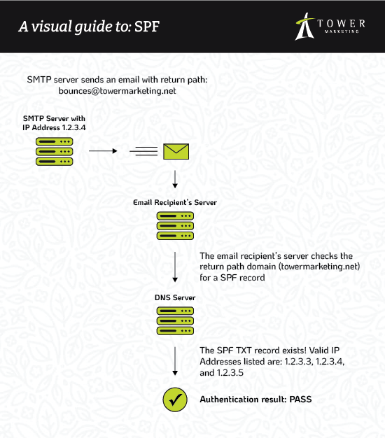
What is SPF?
SPF (Sender Policy Framework) is an email authentication open standard based on a list of allowed IP addresses or hostnames your emails can be sent from. You can think of SPF like a bouncer outside of an exclusive club; if the sender’s IP address isn’t on the list, the email won’t pass the authentication check.
For example, here is the SPF TXT record for towermarketing.net:
DKIM (DomainKeys Identified Mail) is an authentication method that uses encryption to ensure your message content hasn’t been tampered with.
To set up DKIM, you must first create a pair of keys: one public and one private. There are several third-party tools you can use to generate these keys, or you may be able to create them through your email service provider.
The public key is added as a TXT record to your DNS server. Here is an example of a public key:
The private key, stored on your SMTP server or with your email service provider, is used to generate a signature before the email is sent. This signature is comprised of several parts, but the header and body content are converted into unique strings of letters and numbers called “hashes .” These hashes are then used in the encryption, decryption, and validation processes to prove the content is legitimate and has not been modified by someone else before it arrives in your inbox.
What is DMARC?
Your DMARC (Domain-based Message Authentication, Reporting & Conformance) policy is a TXT record added to your DNS server. It is used by a sender to indicate their messages adheres to SPF and DKIM, and provides instruction to the recipient with what to do with an email that isn’t authenticated by SPF and DKIM. It can be set to one of the following:
None: Do nothing and allow the email into the inbox even though it failed authentication. For obvious reasons, this is not a recommended approach.
Quarantine: Send the email to the spam folder.
Reject: Do not deliver the message at all.
In addition to checking the pass or fail results of SPF and DKIM, DMARC adds an extra layer of security by ensuring that the email’s sender domain (in our case, towermarketing.net) is the same as the email address listed in the DMARC record.
If you’re like me, it helps to have a visual aid when trying to understand a complex topic like authentication. Learndmarc.com provides step-by-step explanations and examples of SPF, DKIM and DMARC in action.
What is BIMI?
Brand Indicators for Message Identification (pronounced bih-mee) is an industry specification for message identification that builds on your DMARC policy. If your email passes SPF, DKIM, and DMARC authentication, you can then set up BIMI to display your pre-approved logo in inboxes that support this functionality.
BIMI is the brainchild of The AuthIndicators Working Group, a collection of companies including Fastmail, Google, Mailchimp, Proofpoint, Twilio SendGrid, Validity, Valimail, and Verizon Media (the owners of Yahoo). Their joint goal is to improve inbox security and reduce fraudulent messaging by making authentic emails instantly recognizable.
BIMI is a way of rewarding people for putting in the hard work of securing their emails by allowing them to put their brand’s logo on display. This also builds brand recognition and trust with your email recipients.
Before you jump into the world of SPF, DKIM, DMARC, and BIMI, it’s important to understand the basics of email marketing. Creating a strategic plan, a healthy customer list, and relevant messaging are all keys to success–and if you need some help, Tower has you covered.
If there’s anything that’s been learned in the wake of the pandemic, it’s the importance of having an up-to-date online presence that represents your brand just as well as a face-to-face meeting. Your brand is a lot more than just a logo and some copy. It should be an experience.
As a digital marketing agency, we help our clients explore new strategies to elevate their brand via web design, creative, content, and more every day. However, just as we encourage our clients to explore new ideas in their digital marketing, it’s only fair that we take our own advice.
While our brand refresh started in a seemingly “regular” world, it certainly ended in a changed one. In early 2020, as we dove into redesigning our site, content, and digital assets, our team was suddenly scattered. On top of that, most (if not all) of our regular routines were paused.
In spite of everything, we successfully elevated and reached our goals. Here’s the “why” and “how” behind our recent brand refresh and some tips you can apply to start your own along the way.
Rebranding vs. a Brand Refresh
Before digging in, it’s important to understand the key difference between a brand refresh and a rebranding project. The idea behind a brand refresh is that you’re reimagining the feeling of your brand using what you already have. It’s primarily a visual process where you adjust your assets to keep your business looking current.
Our previous website was from 2017 and was due for a redesign, knowing it’s optimal to update your site every 3 years. Plus, it was clear it didn’t match the direction our company had evolved into as well. However, the catalyst for updating your digital branding shouldn’t always just be an “older design.”
As soon as your online branding feels out of alignment with your business strategy or vision for the future, it’s an indication that it’s time for a refresh. Sometimes that can just be minor tweaks to what you have, while other times more drastic action is required.
For Tower, we saw a need to elevate our own branding to match the shifts we’d undergone in the past few years. While we didn’t need to do a complete overhaul, we found a lot of opportunities to push ourselves beyond what we had done in the past.
Why a Brand Refresh Matters for Your Business
Your business is making progress every day. As you move forward and scale your company, it’s important to also continue refining and evaluating your brand to keep it sharp. This doesn’t always require designing a completely new logo or color palette. Refreshing your brand can include updating content on your service pages or replacing old, outdated images.
There’s no set time frame for how often you should be doing a brand refresh. However, the industry you’re in can have a hand in how often you make these types of changes.
If you’re a brand rooted in history, stability, or security (like a financial institution or college) you shouldn’t have to refresh that frequently. However, if you’re in a fast-growth industry like tech, your business will likely need a brand refresh more often to compete in the digital landscape.
The Key to Re-Doing Online Branding in Digital Marketing
When it came time to approach this project, our team found it extremely helpful to establish some simple ground rules and then outline a process before digging in. Our ground rules throughout the whole process were to:
Keep our signature green color
Keep our current logo
Keep Cabrito (our main typeface we created internally)
From there, we then completed a visual audit of all our materials including our website, business cards, previous campaigns, social media posts, and much more. Our team sorted various assets into two categories — one for assets that “work” and one for those that “don’t work.”
While this part of the process required a lot of back and forth between our broader team, it spurred useful conversation. This audit allowed us to pair down the elements we liked and the ideas behind them, as well as see what areas needed the most attention. From there our team got to work redesigning creative, strategizing SEO, experimenting with dev, and drafting new content to match our updated brand voice and tone.
Think Outside the Logo
For any business diving into these types of changes, the biggest pitfall is thinking your brand is just a logo. At Tower, we encourage you to take a holistic marketing approach. Ultimately, your business is conveyed through everything — fonts, type treatments, colors, patterns, layout compositions, photography, written content, and much more.
The goal is to make sure all these elements are cohesive to the point that even when viewed separately, they still clearly portray your brand in the same light. When you take the time to do this, the benefit is that your brand becomes recognizable for consumers. It sticks.
For Tower, we started by pinpointing the areas we wanted to change and then got to work fine-tuning every single element. In the end, our goal was to make sure everything fit that holistic approach.
Finding Your Inspiration
Our office has a saying that first came to light when our team brainstormed for a campaign a few years ago — “elevate.” Over time, it became a crucial part of how we approach marketing for clients and, ultimately, ourselves. We took that concept and we ran further in terms of this brand refresh.
“Elevate” was behind every decision we made in the process. We went as far as taking pieces we thought were good and working to make them even better.
Anything that wasn’t working and had even become dated or cliche was scrapped altogether. The idea of “elevating” became our litmus test for all design, content, and development choices.
Staying Inspired in the Unexpected
While the state of our clients and our business had to rapidly evolve to respond to the pandemic, our team still continued pressing forward with our brand redesign. If anything, the pandemic opened up interesting opportunities to look at the idea of collaboration differently.
Collaboration is certainly the key to creating, however, there is also great value in having a chance to actually retreat from distraction and do the work itself. Being remote gave us a chance to become fully immersed in the project and our ideas without any interruption. Working in this hyper-focused manner was actually a huge benefit to developing the more difficult and complex elements.
However, our team also balanced working remotely by supplementing our progress with check-in meetings and plenty of video calls. Doing this allowed us to clearly communicate and stay on the same page.
Ultimately, here’s the biggest takeaway — it’s important to build in pockets of time to collaborate on refreshing your brand with others, while also balancing it with uninterrupted time to work individually on it.
Make sure that a part of your project includes investigating your competition. Ask yourself the following:
What are they doing?
What are they saying?
What is their user experience like?
What can you do better?
You want to avoid doing or saying the same message. Otherwise, you won’t stand out. You need to be refreshing your brand not not just to “look good” today, but to ensure you stay relevant in the months ahead.
Develop Your Unique Value Proposition
As you’re working, make sure you take time as a team to be introspective of your company. Clearly define what makes you different. In our case, it was the idea of “elevating.” However, that won’t be the differentiator for every company, and you’ll need to decide what makes yours unique.
It’s worth devoting the time to sort this part out during your brand refresh process. Knowing your unique value proposition as a business will keep your strategy clear and brand refresh work cohesive. Plus, that differentiator can even become the very hook that draws in your target audience to choose you over your competitors.
Know it’s time for a brand refresh, but need help executing it? Contact our team to learn how we can help you reach your next goals with our creative services.
We hear from businesses all the time that are looking for a new logo. Perhaps they’re starting a new company or are looking to modernize their business. But what many of these businesses don’t realize is that creating a brand identity will provide far more value to their company than simply redesigning their logo.
If you’re not sure where to start when creating a brand for your company, here’s everything you should know before approaching a rebranding project.
What is a Brand Identity?
Simply speaking, a brand identity is the set of elements that establish your business visually and set it apart from your competitors. These elements likely include a logo, color palette, fonts, and key pieces of messaging. They must be consistent but flexible, and perhaps most importantly, they must be functional and easy to use.
But creating a brand identity is about much more than a handful of visual elements. Your brand is in everything you do. It’s the greeting you use when you answer the phone. It’s the decisions you make on packaging and materials. It’s how you react to a crisis. Your brand is what makes you, well… you.
Your Business’s First Brand vs. Rebranding
While the process for a first brand vs. a rebrand may look similar, there are a few key differences to keep in mind.
Your First Brand
If you’re a start-up or new company, you likely won’t have as much data on your customers as an established business. In this case, external research is especially crucial to make sure you have a clear picture of your potential customers. Doing this research will not only help you in creating a brand identity, but may also be of use in your business development strategies and your lead generation.
If you’re working with venture capital, a startup incubator, or any other investors, you’ll also need to keep them in mind. The buy-in of these key players is essential to a successful brand launch.
Before you engage with a logo designer or agency, outline the internal process for your team. Include a timeline, key players who will be involved at each stage, and a budget. This will ensure the brand is developed on time and on budget and will help your key stakeholders feel included in the process.
Rebranding
If you have an existing brand and are considering rebranding, you have a major advantage over new companies since you know far more about your customer than they do. The flipside is that it can be harder to separate yourself and your view of your company from how your customer sees you.
For example, you may have in your mind that you need to level up your brand into a more formal, professional space. However, your customers may love your approachability and lack of red tape.
While pleasing higher-ups and stakeholders matters, your company’s success relies on your customers. Balancing the needs and desires of both groups will ensure that you develop a successful brand strategy.
Part One: Understanding Your Audience
While it can be tempting to put pen to paper and start sketching out logo ideas, it’s crucial that your brand begins with your audience.
Who Is Your Audience?
Understanding your audience is the first step toward creating a brand. You’ll need to get inside your customers’ heads to understand what they look for in a product or service, what drives them to make decisions, and how to make them choose you over your competitors.
Performing social listening to see what customers are saying
Asking customers to fill out surveys (online or in-person)
Developing a persona to better illustrate your typical customer
Diving into Google Analytics, social analytics data, or other information you may already own that can tell you more about your customers
Hiring an agency to create an audience intelligence document for your company
Once you’ve decided on your method, you may need to complete further research to understand how to leverage the method you’ve chosen. Fair research without bias or leading questions is your best chance at understanding your customers authentically.
Here are some questions to consider when researching your audience:
Are your customers consumers (B2C) or businesses (B2B)?
What is/are your main demographic(s) – age, gender, location, etc.?
What is their education level? Financial status? Marital status?
What drives them to choose you over your fiercest competitor?
What matters to them most? Price point? Quality? Convenience?
You’ll be far more successful in creating a brand identity once you have a solid understanding of your customers and know what makes them tick.
Part Two: Strategizing Against Your Competitors
In addition to researching your customers, you’ll also want to take a deeper look at your competition. You may have already gathered a list of competitors your customer mentioned in your former research, but don’t be afraid to include other competitors you know in the industry.
What do their brands look like? Do you want your brand identity to stand out from the crowd? Or would you rather blend in but do so with perfect execution? What do their brands do well and poorly?
Answering these questions as you engage with a brand designer will help you have a clearer vision of what you want. And, it will help guide conversations about your fonts, brand color palette, and brand voice down the line.
A logo we developed for outdoor gear retailer, Enwild.
Part Three: The Logo
Getting a new logo is exciting. It’s one of the most visual pieces of your brand and is an element you’ll likely interact with on a daily basis. Plus, it’s the face of your brand when it comes to customer interaction. Here are a few tips to make sure you get the most out of your new logo.
Put Your Customer First
It can be hard to distance yourself from your company’s brand, but remember that you are not your customer. When creating a brand identity, try to put yourself in your customers’ shoes. Think about their demographic, the other brands they likely shop from, and how your brand can best appeal to them. Just because you don’t like brutalist design or the color orange doesn’t mean it isn’t a great option that your customers will love.
Provide Great Feedback
One of the areas where many companies struggle is in providing their logo designer with concrete, specific feedback. Keep these things in mind to make your revision rounds go as smoothly as possible:
You won’t like every design option you receive, and that’s okay. Don’t be afraid to speak your mind truthfully. Your designer has heard it all before and would rather take the criticism and help you develop a logo you love.
Incomplete or partial feedback wastes your valuable time and money. Provide complete feedback from all relevant stakeholders, and resolve any internal disagreements before the feedback is sent.
Be specific and resolute. Take time to absorb the logo options you’ve been given before providing feedback. Try to pinpoint the elements you like and those you don’t to give your designer clear action items moving forward.
Ask for the Right Assets
The best logos are flexible and have different options to utilize depending on the situation. For example, you may want a single-color logo for embossing or an icon version of your logo for tiny applications.
Here are some of the variations you may want to consider requesting from your logo designer:
Horizontal and vertical options
Icon only/text only
Black and white/one color/two color
With and without copyright or trademark symbols
Optimized for embroidery or vinyl cutting
Transparent/vector/pixel-based files
Your logo needs to be flexible but consistent. Getting the assets you need upfront will help your brand be a success for years to come, even if you don’t have an ongoing relationship with your brand designer.
Part Four: Supporting Brand Elements
In addition to your logo, your brand should be defined by supporting elements like colors, fonts, textures, and messaging. While your logo may be the most recognizable visual, your brand is nothing without a complete suite of elements.
Imagine Mcdonald’s without their signature red and yellow, or Amazon’s logo in a script font. Logos need the support of a full brand strategy to do their best work.
A colorful but intentional color palette our design team created for Robertson Insurance.
Brand Color Palette
Color palettes can be a divisive topic within a brand. You may be tempted to call out your favorite color, or maybe you want to stay with your existing colors because they have worked thus far.
Here are four things to consider when choosing or approving a branding color scheme:
Your color palette should reflect your brand, not your personal tastes. Just as red and black would never be appropriate for a daycare, there are likely colors that don’t make sense in your industry or your niche within your industry.
Different colors evoke different emotions. There’s a reason the cereal aisle is full of red and orange boxes and that most luxury companies focus on black and white: because brand color psychology works. Your designer will be able to help you pinpoint which colors are best for your industry, but consider the emotions you want your brand to evoke. Respect? Excitement? Trustworthiness?
Take a look at your competitors’ color palettes. Do you want to blend in or stand out? There’s no wrong answer, but knowing what your brand will look like amongst your competitors matters. The best brand colors are intentional and strategic.
Consider contrast for readability and accessibility. Just like brick-and-mortar businesses need to offer accessibility in the form of wheelchair ramps and elevators, online businesses should consider accessibility in terms of their design. While it’s a bit more complicated than just choosing the right colors, keeping accessibility in mind during discussions about your brand color palette can save you trouble later.
A typography-focused logo for law firm Chieppor & Egner, LLC.
Fonts
Choosing a font for your brand is another discussion where everyone will have an opinion. What’s most important is to focus on your customer and your industry over your personal tastes. Check out our four top tips on how to choose fonts for your brand:
Keep it simple. Your entire brand only needs one to three fonts. Choosing more than three fonts can make your brand look disconnected and hodge-podge.
Prioritize legibility. Sure, a thin script font may be the perfect fit for your brand, but it loses its value if no one can read it. Consider various applications — from massive billboards to long-form documents — when choosing a font for your brand.
Let your brand voice shine through. Your fonts should give customers a subconscious first impression of your company’s personality and values.
Messaging, Voice, and Tone
When it comes to brand messaging, what you say matters – but how you say it is just as important. No matter who is writing on behalf of your brand, the tone and voice must be the same. This presents a cohesive and professional front for your business that will earn customers’ trust and loyalty.
The voice and tone you choose should be consistent with the brand identity you’ve created. It might be exciting and fun-loving or determined and resolute. Whatever it is, it must be steady and present in all elements of your brand.
You’ll then need to convey your business’s new tone and voice to all employees who speak or write on behalf of the brand. Consider creating a brand standards guide that answers questions like:
How do I greet customers or clients?
What should I say when I answer the phone?
What person and tense do I write in?
How do we address (or not address) difficult subjects like religious holidays, social movements, and political events?
What is the elevator pitch for our business?
Are there any terms or industry jargon we want to avoid?
How do we react to crises in writing (both externally and internally)?
Part Five: Rolling Out Your Brand
Once you’re given your final logo and other brand assets, you may think the hard work of creating a brand identity is over. But the truth is, the way you present and roll out your brand to the rest of the world is just as crucial to its success.
Announcing Your New Brand Internally
Getting employee buy-in of your new brand is key. Whether you opt to include employees throughout the branding process or only notify them when the brand is complete, it’s important that you present your new brand in the right way.
One of the logos our team developed for the National Novelty Brush Company.
Consider a presentation, offer free swag like t-shirts or water bottles, and include plenty of time for questions and answers. The way your brand is perceived internally will set the stage for how your employees convey your company to customers and business partners, so it’s imperative that they have a positive view of the new brand.
Announcing Your Brand Publicly
Perhaps even more important than presenting your brand to your internal team is announcing it to the world. If you’ve seen one of the many new branding flops over the years, you’ll know just how much first impressions can matter when creating a brand identity.
Depending on your industry and the size of your business, you may want to consider some of the following:
An event to celebrate the new brand reveal
A formal press release to share through PR outlets and on your website
A PPC campaign to clarify the change for users if your rebrand involved a name change
An email campaign to announce the change to your current customers or clients
A short statement to share on social media and your website
A letter and swag bag to send to key investors and stakeholders
Creating Consistent Ongoing Brand Collateral
Finally, you’ll need to set your new brand up for success so it can be used appropriately by your team for years to come. If you worked with an experienced agency, your new brand should come with brand standards and a brand style guide to share with the rest of your team.
A brand guide our team developed for Enwild.
These documents will show appropriate and inappropriate uses of the logo, as well as detail the fonts, brand color palette (in RGB, CMYK, HEX, and Pantone), and resources that are allowed within the brand. They will help your team stay true to the brand as the designer intended it and will give you a resource to turn to when in doubt. Everyone in the company, from the CEO to an intern, should feel comfortable using the brand and be able to identify inappropriate use.
If your agency didn’t include one, you may also want to create and circulate a tone and messaging document that explains any changes to the brand voice. This can be especially useful if you had no formal brand in place prior to your rebrand.
Part Six: The Future of Your Brand
You’ve done it. You’ve created a brand identity that shows the world who you are and where you shine. So what next?
While you likely did some outreach during your initial brand launch, ongoing Internet marketing can help you continue to grow your brand awareness and bring traffic to your website. You may want to consider search engine optimization (SEO), social media marketing, email marketing, or content marketing to engage new audiences and grow your business.
Above all else, stick to your brand standards, encourage your team to evolve your brand over time, and enjoy the process.
Considering rebranding your business? Creating a brand identity can be a rewarding and engaging experience with the help of a trusted brand designer.